|
Ok, so this post was born from a random comment on Instagram a while back where someone asked if I had ever shared a video of myself styling a bookshelf on video so they could see my process and watch me shift things around… and I was like “would it be interesting/helpful if I recorded myself doing that and shared it?” And then so many people commented under that to basically say YES DO THAT. So I did. And here it is. 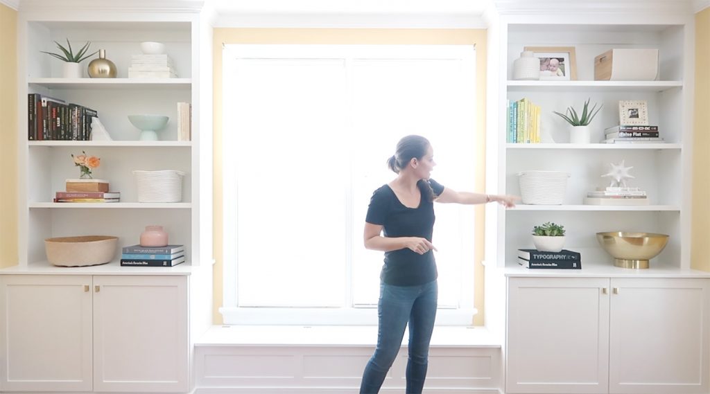
My friend Teresa recently added built-ins to her living room and asked if I’d mind coming over to style them. She knows my soul, and is well aware that’s basically my love language (tied with cheese and shrimp). And thanks to that IG request a while back, we brought the camera & tripod to capture it all. Speaking of her new built-ins, this is what the room looked like before with the Ikea bookcases they had from their last house. 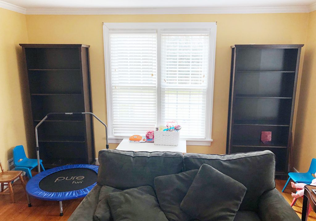
And this is what they built with the help of her dad. These things are amazing! The bench seat under the window even folds up to reveal an extra compartment for stashing stuff, along with those two big base cabinets for concealed storage on each side. Let the record state that there’s nothing wrong with Ikea bookcases, and they can look fantastic. We’ve had inexpensive freestanding Ikea bookshelves in our office for the last five years and love them. In Teresa’s case, she and her husband Andrew said they fit better in her old house – but ever since they moved six years ago they dreamed of someday adding built-ins along that wall. And it finally happened thanks to her extremely handy dad (John was literally wolf-whistling at the finished product). And then I got to swoop in and style them. Much like nearly anything else you do, there’s a definite learning curve to tackling a bookcase. And I have a few specific (and very easy/free) things you can try that’ll help A TON. So you can hopefully skip over some of the mistakes I made for years and get to a finished result you love. 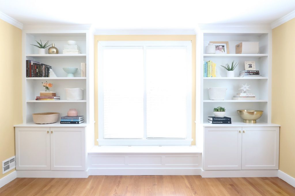
Oh and whenever we talk about bookcases there’s the inevitable question about what the ratio of books to other objects should be. It most likely will just depend on how many books you own and want to display in that area. That’s how we landed on the number of books on the built-ins in this video. Since they have other spots with books in their house, and that huge lower bench seat serves as additional book storage for the ones they didn’t want out, I just styled the shelves with the ones they wanted up there. It was that simple. Just do whatever you like – it’s your house. Ok, but on to the video, which I truly think demonstrates so much more than words and even photos can: Note: If you are viewing this post in a feed reader, you may need to click through to see the video player. You can also watch it here on YouTube. We looked back at the timestamps, and the entire video took about 22 minutes to film, but I had spent around 10 minutes arranging things into stacks and groupings before we started filming (more on that in a second). So the full process took me about 32 minutes, but it could definitely take you longer if it’s your first or second try at loading up a bookcase. But the key thing to note is that I just kept trying things. Did you see how many items I put down and then moved around?! BASICALLY EVERYTHING. There is so much trial and error, so just try to stay flexible and switch things around until you step back & love what you see. You’ll have to watch the video to see me demonstrating each tip that comes up on the screen (so definitely come back & watch that if you can’t now). But in addition to those tips – here are three more extra things I thought of after I recorded the video. Initial Prep Makes Things A Lot EasierBefore ANYTHING goes on the bookcase(s), take out everything you want to put on them so you can see it all together on the floor en masse (like books, large vases, storage boxes and/or baskets, potted plants, picture frames, etc) and combine things to make LARGER GROUPINGS. For the books, put them into larger horizontal and vertical groupings. You can group them by color or subject or whatever you’d like (I often remember the color of a book better than the exact title or author, so I find them more easily when I group ’em by color – but do whatever works for you). You might also have decorative boxes that you can stack to create a larger grouping. Or smaller objects that you can add to the tops of a few stacks of books that you’ve already made to add height and finish them off. You also might have similar objects that you can display together to make one larger grouping that reads as less busy (for example, a collection of 3 blue glass vases that you can group on top of a large horizontal stack of books). This initial grouping step with everything laid out on the floor makes the entire process FAR EASIER. In the adjoining room to the bookshelves in this video, I did this exact thing on the floor. So that’s why I just breeze into frame with a stack of boxes all ready to plop down, or a whole grouping of books that are horizontally stacked together. Obviously large objects like vases and baskets, and smaller objects that you’ll pepper in later won’t necessarily have a grouping yet, but pairing up books and boxes and a few smaller things you’ll be displaying en masse is a huge help. Which brings us to my next extra tip… Fewer Larger Items & Groupings Beat Lots Of Smaller OnesThis tip is born from a mistake I pretty much made constantly for years until it finally dawned on me… LARGER ITEMS AND GROUPINGS ALWAYS LOOK BETTER. Smaller vases sitting alone? Little picture frames not added to a stack of horizontal books or layered in front of a larger one? They look busy. They look piddly. They look lonely with so much space around them. The shelves just don’t look as grounded and balanced and complete when there are tons of little items everywhere. Literally look at every gorgeous built-in you’ve ever seen and they’ll either have: 1) larger items everywhere (like zero small vases or little picture frames or tiny stacks of books anywhere) or 2) smaller items grouped with other things to appear larger and more unified so they don’t read as a bunch of tiny busy items (like stacked boxes that read as a grouping, small vases or frames placed on top of a horizontal stack of books that read as one unit, etc). If you’re wondering why your bookcase looks off or busy or just don’t have the presence you’d like, my very first suggestion would be to remove or group smaller things to unify them and make them read as one larger “unit” to the eye when you step back – and to consider adding a few large scale items like a giant vase, a large basket for storage, or some larger book stacks. Sidenote: this also works for mantels, tabletops, open shelving, etc. Also, This Can Be Gloriously Free!Don’t forget to check wherever you have extra storage, (the attic, the garage, or even your kitchen cabinets) for large vases, plant pots, frames, and boxes. I often have to style shelves when I stage homes (more on that here and here) and I’m always scouring the house for anything I can use! I’ve totally stacked white shoeboxes and brought in pretty decorative bowls from the kitchen! In the words of Jay-Z, “I’m a hustler, baby. I just want you to know.” Sometimes just 30 minutes spent using what you have around the house & trying a new arrangement or grouping can make you SO HAPPY. I did it a little while ago with our own living room built-ins and it still feels like a breath of fresh air whenever I walk in there. Talk about a free pick me up! 
Can you tell that bookcases excite me? Anyway, I hope the video helped and that you have fun tweaking any shelves or bookcases you have at home. And if you want some other posts that have photos of built-ins or bookcases (or tips for making them), here’s one about building & filling our own living room built-ins, here’s another one where I share how I approach bookshelves when I’m staging a house, and here’s a podcast we did full of tips for anyone who wants a bookshelf full of books (without a lot of accessories in the mix). P.S. Have you signed up for our free newsletter? It’s like a bonus post that comes to your inbox once a week and we promise never to spam you – you’ll just get tips and photos you can’t see anywhere else. The post How I Style A Bookshelf (Captured On Video In Fast Motion) appeared first on Young House Love. Via https://www.younghouselove.com/how-to-style-a-bookshelf-video/
0 Comments
So it turns out there are some weird spots in the kitchen where germs go to party – so we’re learning more about that (and what you can do about it), as well as talking about why we gave up on those meal delivery kits and found a better solution for our family. We’re also talking about how shopping for your home can be fun, but it can also be frustrating and time-consuming. So we’re sharing our tips for how to streamline your hunt and pick things with confidence. Plus, you’ll hear how our backyard is finally winning the war against our hungry deer, and what new face thing Sherry is obsessed with now. You can download this episode from Apple Podcasts, Google Podcasts, Stitcher, TuneIn Radio, and Spotify – or listen to it below! Note: If you’re reading in a feed reader, you may have to click through to the post to see the player. What’s New
What’s Not Game
Listener Question

We’re Digging
If you’re looking for something we’ve dug in a past episode, but don’t remember which show notes to click into, here’s a master list of everything we’ve been digging from all of our past episodes. You can also see all the books we’ve recommended on our Book Club page. And lastly, a big thank you to Agility Bed for sponsoring this episode. For Memorial Day you can get 15% off your ENTIRE ORDER. Just visit AgilityBed.com and enter your email address to unlock the discount. And after the 28th, you can still use the code YHL to get $200 off a hybrid mattress of any size. 
Thanks for listening, guys! *This post contains affiliate links* The post #142: Our Kitchen Is Grosser Than You Think appeared first on Young House Love. Via https://www.younghouselove.com/podcast-142/ Ok, two more duplex rooms are finished and photographed! And these two involved some sweat equity. We built in some nice tall storage cabinets next to the stacked washer/dryers, and also added two hook rails per room (you can never have enough hooks at the beach!). As a side note, the way that the kitchens connect and flow into each laundry room / mudroom is one of my favorite things in the entire house. From the bold statement tile backplashes and fun tiled mudroom floors to the painted pocket doors (we added those to make it possible to close off the sound of laundry if you’re cooking, dining, or watching TV) – it’s just an area that formerly had zero charm or character. So it feels nice to bring some back! 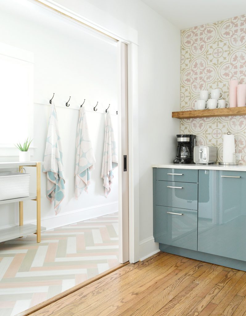
Here’s what the pocket doors look like closed. We went with solid wood doors, but added glass panes at the top so light would still pass into the kitchen through the side window in the mudroom (so it wouldn’t suddenly feel dark in the kitchen if you close the doors). We LOVE how they came out. These are called half-lite doors if that helps you find them. Ours are by Reeb. And these are the pulls we added to them. Affordable but so stately (they go with all of our other oil-rubbed bronze doorknobs throughout the house). 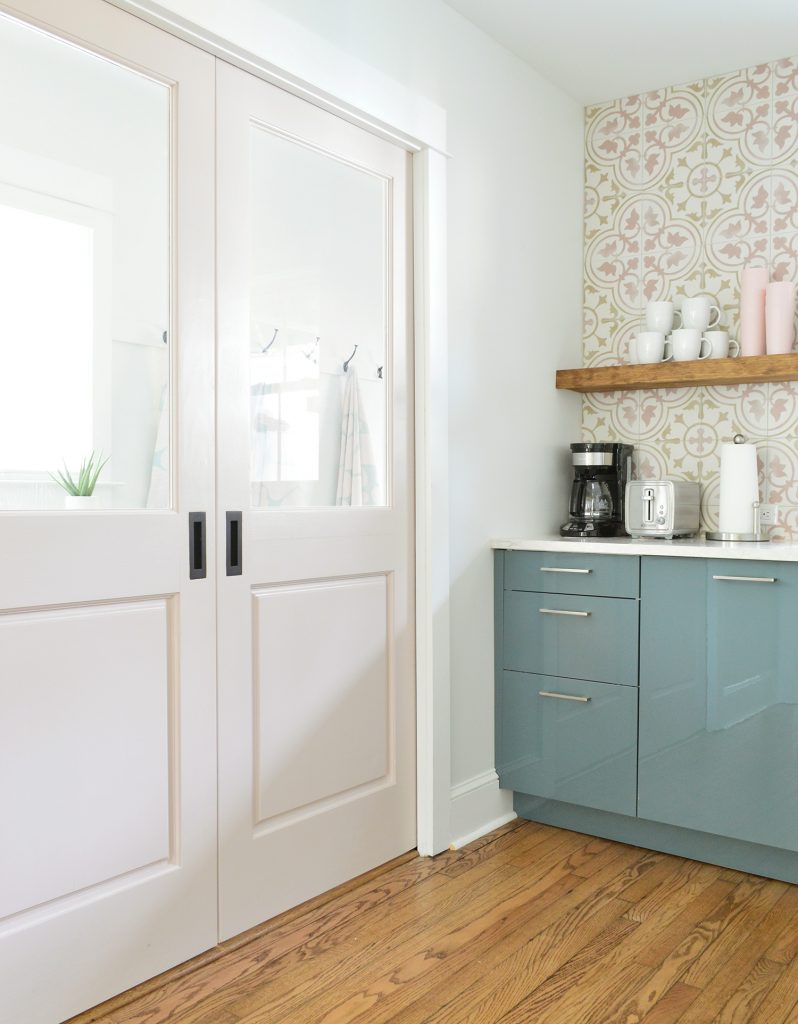
See what I mean about these spaces not having much character before? I mean except for that ceiling fan. 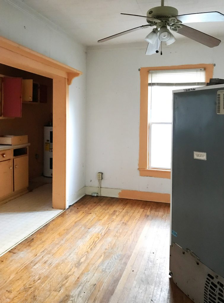
This used to be the view into the laundry room / mudroom, where someone added a very very cramped kitchen at some point (it used to be an open-air side porch, so we know it’s not where the original kitchen was located). These photos are all of the left side of the duplex, by the way, but we’ll get to the right side too. 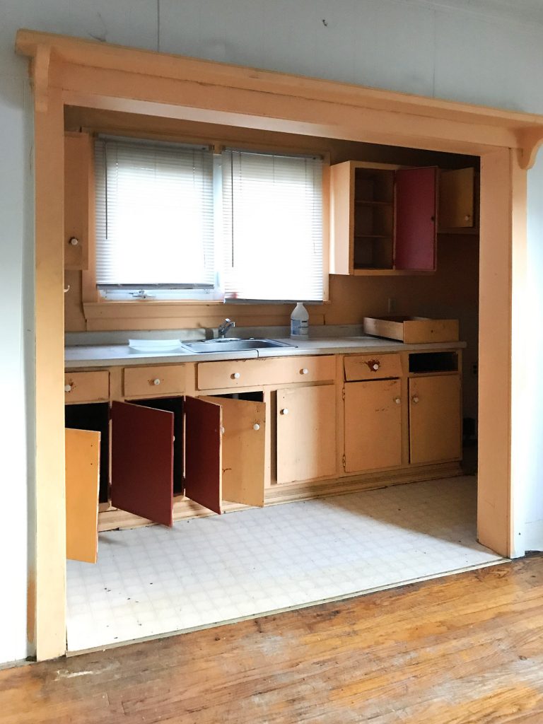
Oh and see those black dots on the sheet vinyl floor in the before photo above? They’re roaches. They were everywhere when we bought the house because someone had set off a bunch of those roach fogger things before we toured it, so they were still sitting on the floors of a few of the rooms, along with all the belly-up roaches. But we were undeterred! Ha! Slightly grossed out, but honestly we have seen worse… Anyway, here’s the view now, looking through that same wide doorway where we added the pocket doors and turned that space into a workhorse of a room – complete with a stacked washer / dryer, bonus “pantry” space thanks to the shelving system with baskets (they no longer sell that Ikea shelving system but here’s a similar one), and an entire mudroom portion to the right with tons of hooks, shoe baskets, a bench, etc. 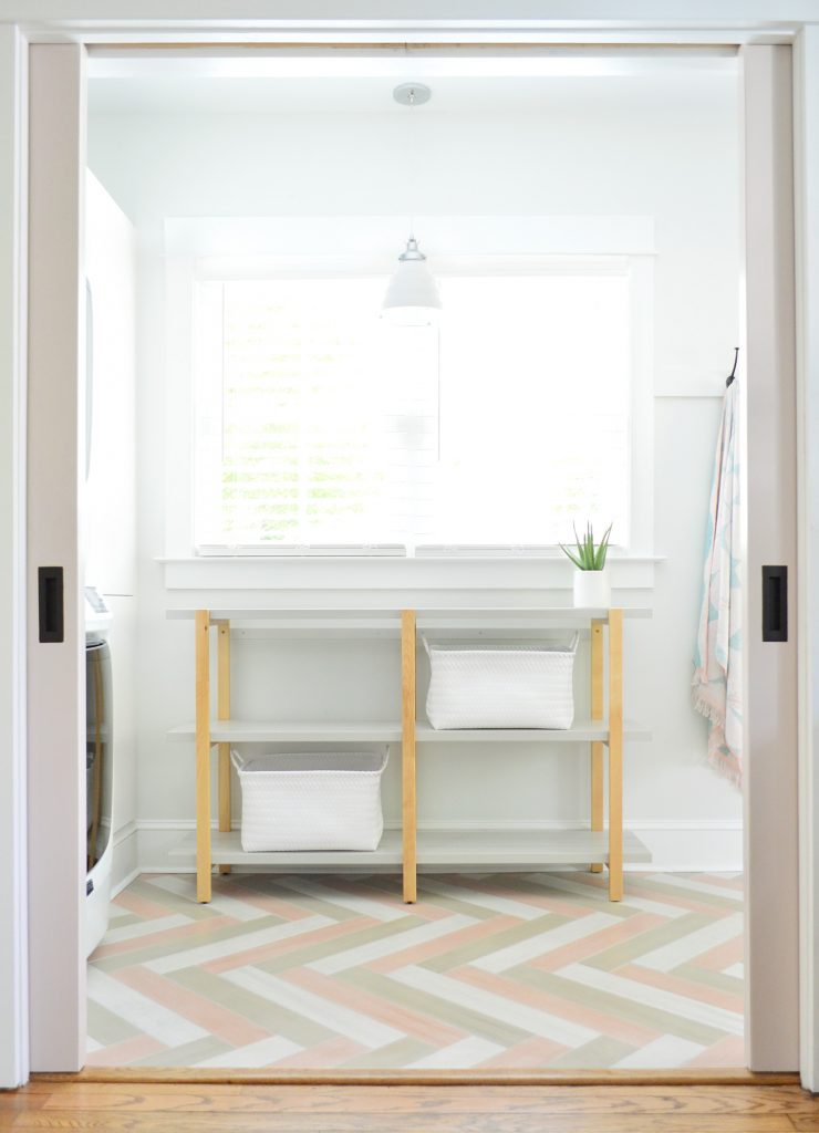
If you walk into the room all the way and place your back to the back door, this is what you see. Our stacked washer &dryer, and the storage cabinet that we built in next to it (it’s an Ikea Sektion cabinet). We had originally planned to install lower cabinets where the shelving system is below that window, so we never expected to have access to that lower cabinet next to the washer & dryer (since the cabinets would have terminated into that area). 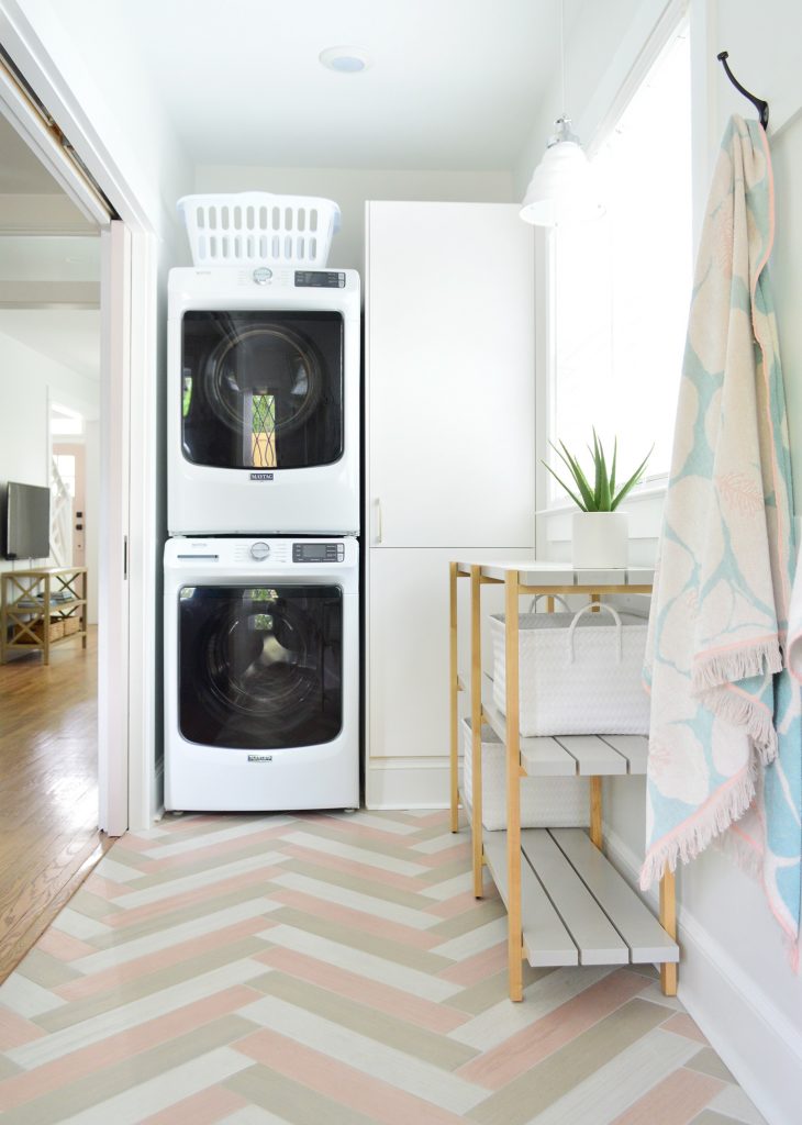
But the nice thing about this setup is that while our guests have access to the upper cabinet (where we’ve stocked laundry supplies, etc), we can use the lower shelf for paint and house supplies since it can only be accessed by moving the shelving system… which we anchored to the wall to avoid any tipping over issues with kids. So renters definitely won’t be going in there (no worries about kids somehow discovering our paint cans and repainting the duplex – ha!) but we can access it whenever we need stuff. Also this floor slays me every time I walk in there. We laid each tile by hand and made the pattern ourselves, but it was totally worth it (more on that process here). Anyway, if you stand in the doorway with the pocket doors and turn to your right you see our jumbo hook rail, with 8 hooks on it (we love these hooks – so affordable and substantial!). 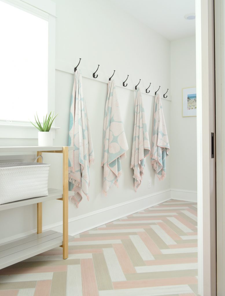
We debated some sort of built in bench with sides and shelves above it (kinda like this mudroom system) but it’s JUST SO NICE to keep things open and flexible like this. If you walk in with your arms full of bags or groceries or luggage, it doesn’t feel like you’re going to smash into things protruding from the wall. Back when it was a kitchen it felt really narrow due to all the built-in things along that side wall. This is the view if you stand with your back to the washer/dryer. The secondhand diamond doors that we hunted down and used in here SLAY ME. I am so glad we held out for them and didn’t settle for anything else. The glass panes let in so much light and echo the original diamond paned windows in the front of the house (you can see those here) and they just feel meant to be on so many levels. 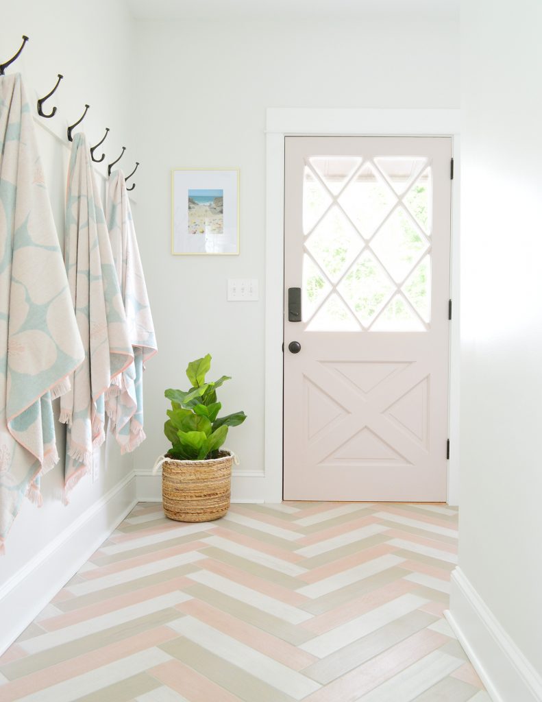
That door is also our the keyless entry door for renters (since the outdoor showers are out back, so lots of people will walk back there to put their beach chairs in the shed, shower off, and come in using their code). We bought this coded door lock and have loved it so far. Approximately 1,379 inspectors and subcontractors and various other people have used it without any issues. And just when you thought 8 hooks was enough, I’m gonna tell you once again that, in the words of The Greatest Showman, IT’S NEVERRRRR ENOUGHHHHH. After spending the summer at the pink house we learned you can literally never have too many hooks, so we added four more along this alcove to the right of the back door for a grand total of 12 hooks. We also shoveda bench in there that’ll come in handy for sitting and putting on shoes, etc – and we even added two baskets to store shoes and stuff like that too. 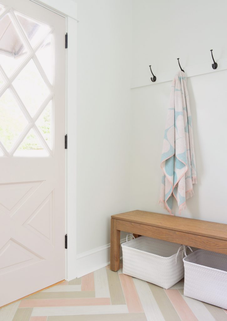
Ok, but now let’s switch over to the right side of the duplex, where it’s sort of an alternate-reality version of the one you just saw. If this house were a choose-your-own-adventure book, and you selected “greeny-gray doors & gray tile” instead of “pink doors and neopolitan ice cream tile” – you’d end up with this room. 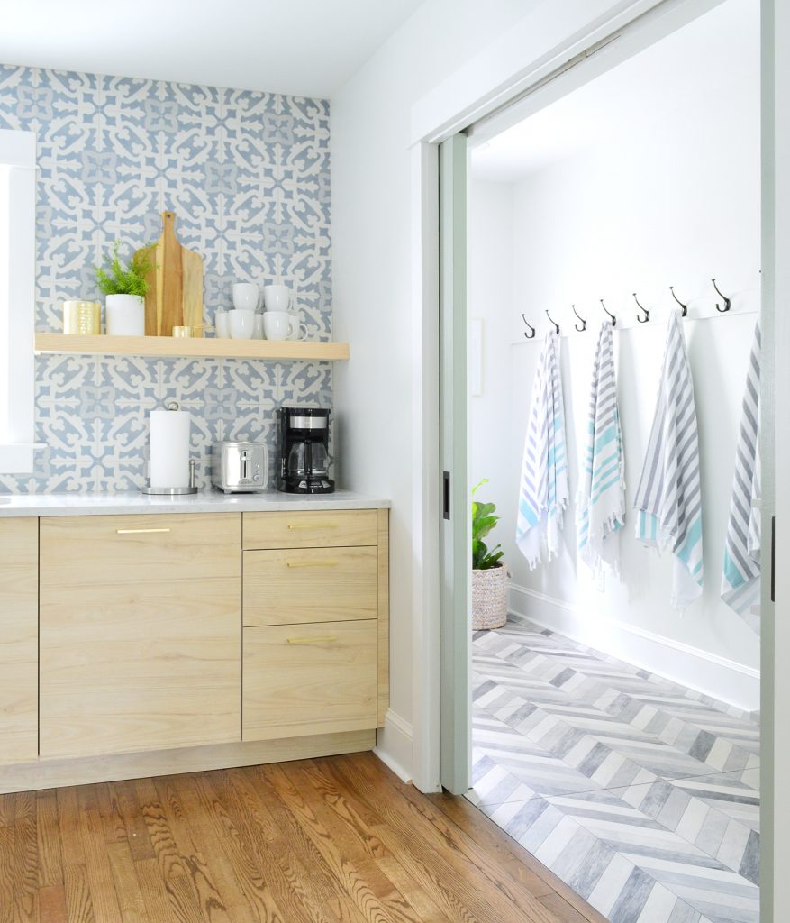
Once again it’s looking very different than what we started with: 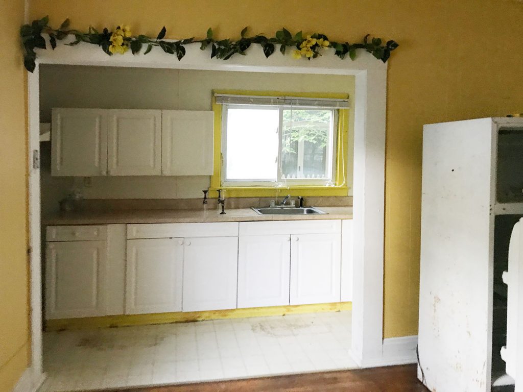
Here’s the current view through the pocket doors that we added. Oh and see how the doors stick out about 3″ on each side so you can easily grab the handles? We did that on both sides of the duplex to make it obvious to renters that pocket doors existed (we worried if they hid totally in the walls people might miss them). All that we did was add wood blocks to the end of the doors, so they can’t fully slide into the wall to hide completely. Plus it’s so handy because you can easily grab the handles to roll the doors closed since they’re always exposed. Handy to grab the handles. See what I did there? 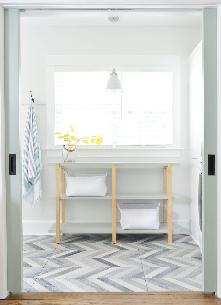
Here’s the view on this side if you rotate to the right while standing in the kitchen and looking through the pocket door opening. Once again we have a stacked washer & dryer with that nice big built-in cabinet next to them. And we bought another Ikea shelving system to provide bonus pantry storage under the window (we picture people using the baskets and shelves to stash all of their chips, cereal, and other snacks that they keep around for the week). 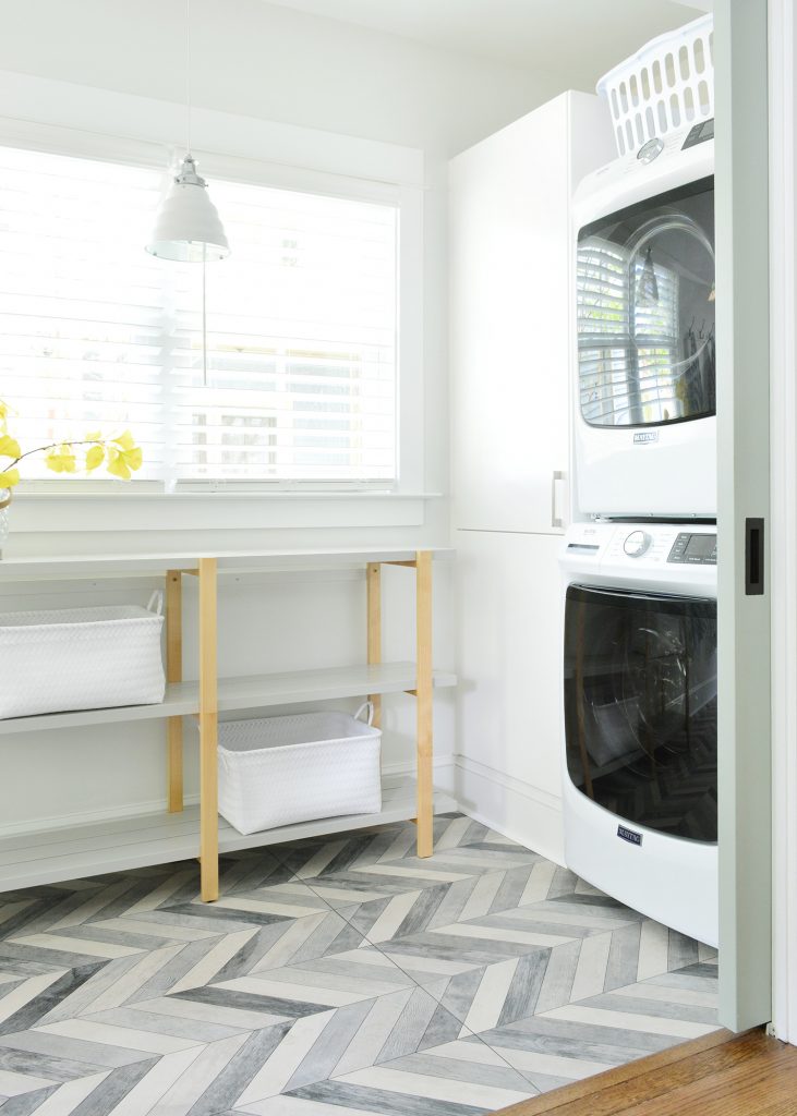
Here’s the view with your back to the back door. Once again the top cabinet of the built-ins is accessible to renters (and stocked with laundry supplies) but the bottom one will hide paint and house supplies for us, and if we need them we’ll just move that pantry shelf (which is anchored to the wall so it won’t tip – and so renters won’t have access to that lower shelf of supplies). 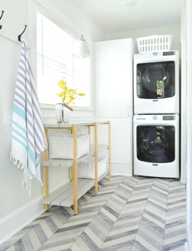
We also have 8hooks along this wall, and can I just say that I love finding great beach towels? These are actually the same ones we bought for the beach house and have used for over a year. I love the design, the playful fringe, and the generous size – and they have held up so well! Highly recommend. 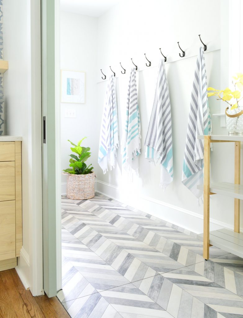
If you take a few steps back into the kitchen, here’s what it looks like with the pocket doors pulled closed on this side. I love how they feel original and substantial but still let the light stream in from that side window in the laundry area. 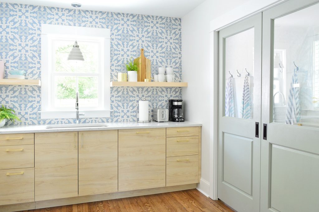
If you step into the laundry room and stand with your back to the washer/dryer, this is the view on this side. This secondhand door wasn’t painted and we could’t bring ourselves to cover that lovely wood tone – so we just clear sealed it. Once again, I just ADORE these secondhand diamond doors. They’re a space-making choice for sure, along with the pretty glass pocket doors. Is it weird to have love affairs with doors? I think it’s fine. 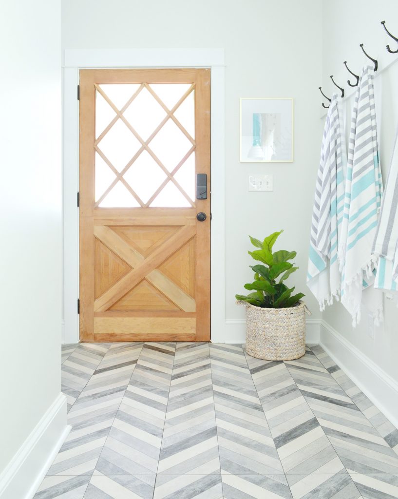
We also added the four bonus hooks in the little alcove to the left of the back door over here (for a total of 12 hooks on this side too). You can see in the photo above that the alcove is a GREAT SPOT to place that bench without encroaching on the walkway when someone comes in carrying a lot of stuff (since it doesn’t protrude where people actually walk). We originally placed the benches under the longer hook rails and they felt really tight – but they make so much more sense when they’re tucked into the alcove and it’s a perfect fit. I’ll have to make a video walk-through for you guys soon, so you can see every single inch of these spaces, and get a better idea of how they all flow together. 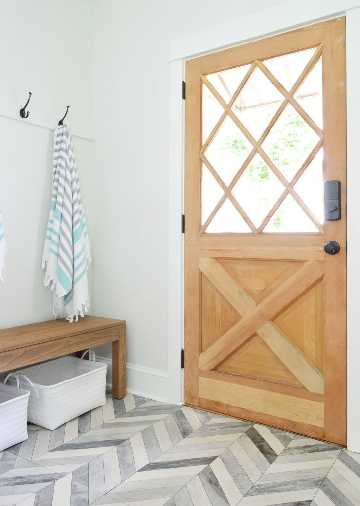
So there are the two mudrooms / bonus pantry space / laundry rooms in each side of the duplex. Not only do they add a ton of function to the entire house, they’re so pretty to our eyeballs. And I literally can’t pick a favorite so don’t make me! P.S. You can see all of the other finished rooms of the duplex that we’ve already revealed (two kitchens! the front! the back! four bedrooms! six bathrooms! two living & dining rooms!) along with how we planned the layout, tiled the floors & backsplashes, etc, etc, etc here in our duplex category. It’s almost two years of updates covered in just 25 posts! *This post contains affiliate links* The post The Duplex Laundry Room / Mudrooms: Completed! appeared first on Young House Love. Via https://www.younghouselove.com/duplex-mudrooms-laundry-rooms/ Our recent Chicago meet-up with fellow bloggers Chris Loves Julia, Yellow Brick Home, and Making It Lovely left us with lots of feels (and very full stomachs). But it was seeing one of their homes in person that completely changed our minds about a “design rule” we had proclaimed for our own home (on this very podcast, no less). We’re also sharing what surprised us most about the final phase of getting our duplex ready to rent. Plus the results of Sherry’s latest staging assignment and a dynamic decor alternative to just hanging another picture frame. You can download this episode from Apple Podcasts, Google Podcasts, Stitcher, TuneIn Radio, and Spotify – or listen to it below! Note: If you’re reading in a feed reader, you may have to click through to the post to see the player. What’s New


Update
Finishing The Duplex

We’re Digging

If you’re looking for something we’ve dug in a past episode, but don’t remember which show notes to click into, here’s a master list of everything we’ve been digging from all of our past episodes. You can also see all the books we’ve recommended on our Book Club page. And lastly, a big thank you to Rothy’s for sponsoring this episode. Check them out at Rothys.com where you get free shipping and returns on every order! 
Thanks for listening, guys! *This post contains affiliate links* The post #141: When You See Another Blogger’s Home In Person… appeared first on Young House Love. Via https://www.younghouselove.com/podcast-141/ Big day, big day, BIG. DAY. Not only are we gonna give you a tour of both completed duplex kitchens, we also FINALLY got our Airbnb listings up and running. Phew! So keep reading for all the photos & the details on how you can book a week there if you wanna check out Cape Charles for yourself (we think it’s the best summer vacation ever – but we might be a little biased). 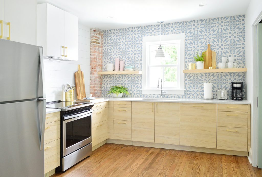
So the picture above is obviously the kitchen with the blue tile & wood cabinets on the right side of the duplex (which you’ve seen bits of already in our post about installing the Ikea cabinets and tiling the backsplashes) but I’m actually going to pop over to the other side – the kitchen with the pink tile & blue cabinets (seen below) for the first part of this post. 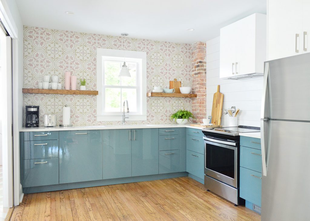
We’ve got so much to show you, but I want to start off by rewinding to the state of things when we first bought the duplex in 2017. This was the view from the living room towards the now-kitchen (see that orange trim through the doorway?). 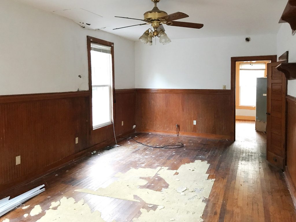
And the previous (clearly not original) kitchen had been shoved into a former side porch to the left of that orange trimmed window above, which didn’t exactly feel like the right spot for it. 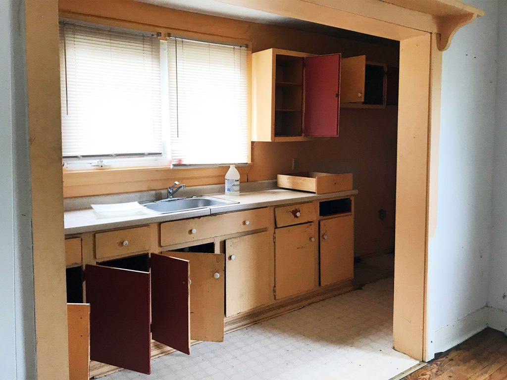
Here’s a comparative “after” shot to the one I shared two photos up. Obviously one huge improvement was widening the doorway (and adding a transom!) to connect these two spaces and maximize flow and light. Plus, now you can see our wall of tile all the way from the front door. 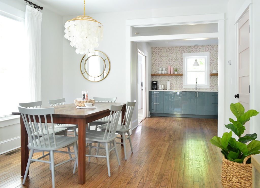
The now-kitchen was actually a dining room of sorts before. We think. Although an old fridge was inexplicably floating in the middle of it. But clearly this bigger room was begging to be the new kitchen. At least that’s what the two-toned trim is saying to me in this picture.
Here’s a similar view of this area now. We raised the base of the window so we could run cabinetry across that wall and added pocket doors so the laundry can be closed off if it’s too loud while it’s running for anyone cooking or eating or watching TV. 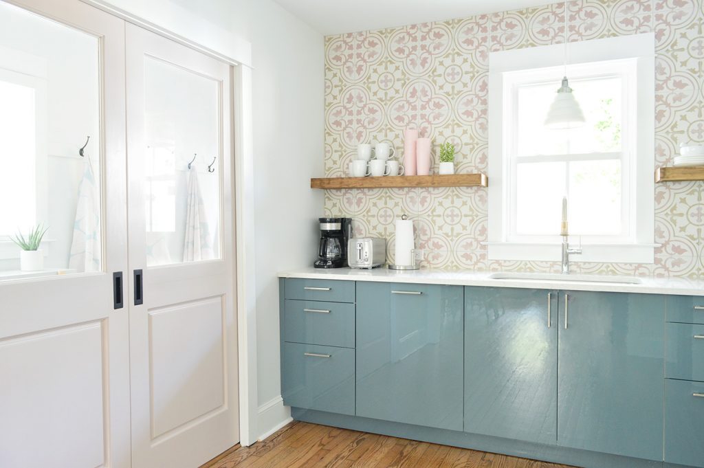
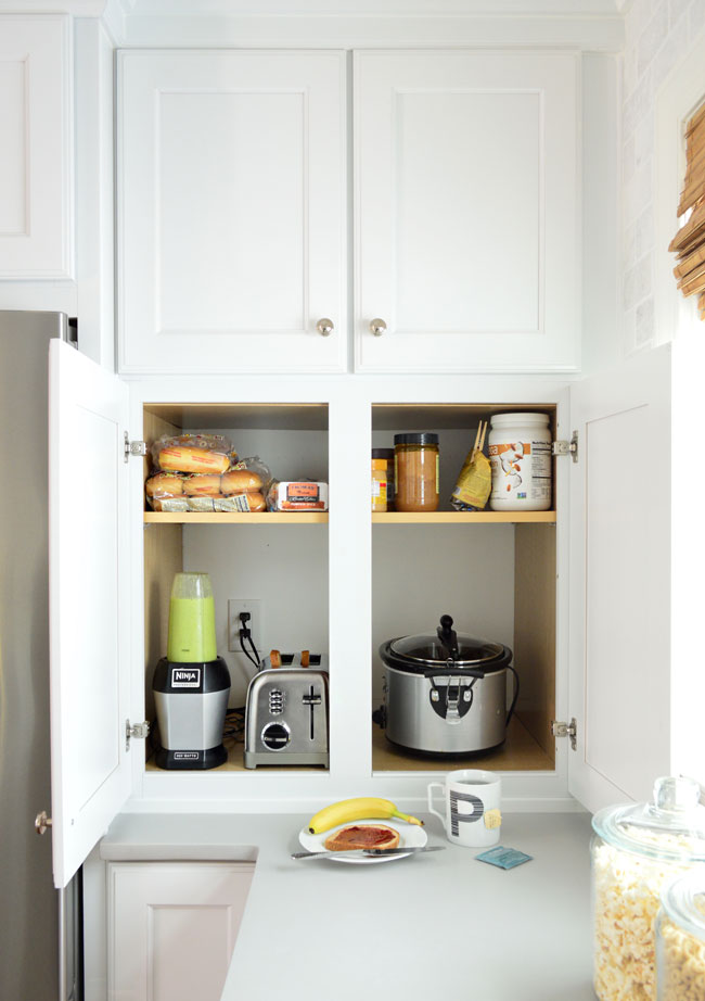
One big update since you’ve last seen these rooms is that they’re actually stocked with stuff now. Blenders, toasters, coffee makers, pots & pans, knives, silverware, serving bowls, plates, cups, wine glasses, mugs, microwaves, even tupperware and salt & pepper are all ready for renters. And yes, there is a cheese grater on each side too. Along with wine openers and chip clips. 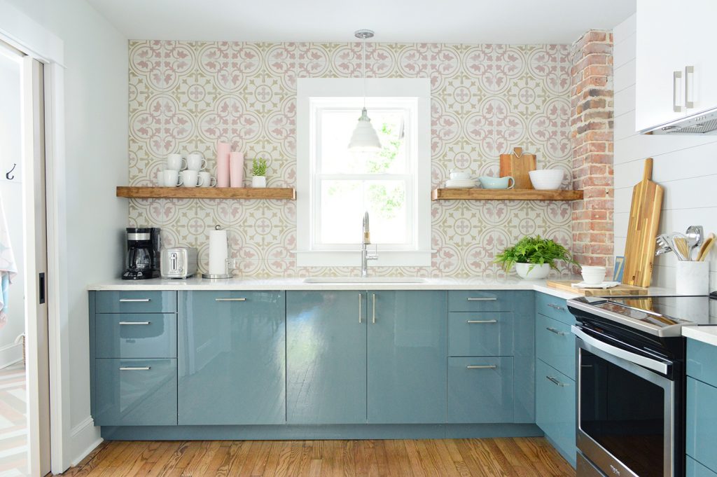
We mentioned in our backsplash post that we opted for a different treatment on the stove wall because it felt too chaotic to continue our patterned tile on that side too (we leaned it up to see how it looked and it felt too crazy on two walls). So we went for something subtle yet wipeable and easy to maintain. Note: We could have done the accent tile on the stove wall, but the back wall’s visible from the front door and has that nice centered window, so we wanted to make that wall the star, and cast the side wall as more of a “supporting character.” Ok, but back to our “subtle yet wipeable solution.” Some call it planking, some call it horizontal paneling, and some call it faux shiplap (real shiplap interlocks), but we were inspired to jump on the bandwagon after long admiring how Shea McGee works it into her beachy/modern home designs, as well as loving Chris & Julia’s TV wall in their family room. Our verdict: what took us so long?! (Also, where do I pick up my Fixer Upper merit badge?) 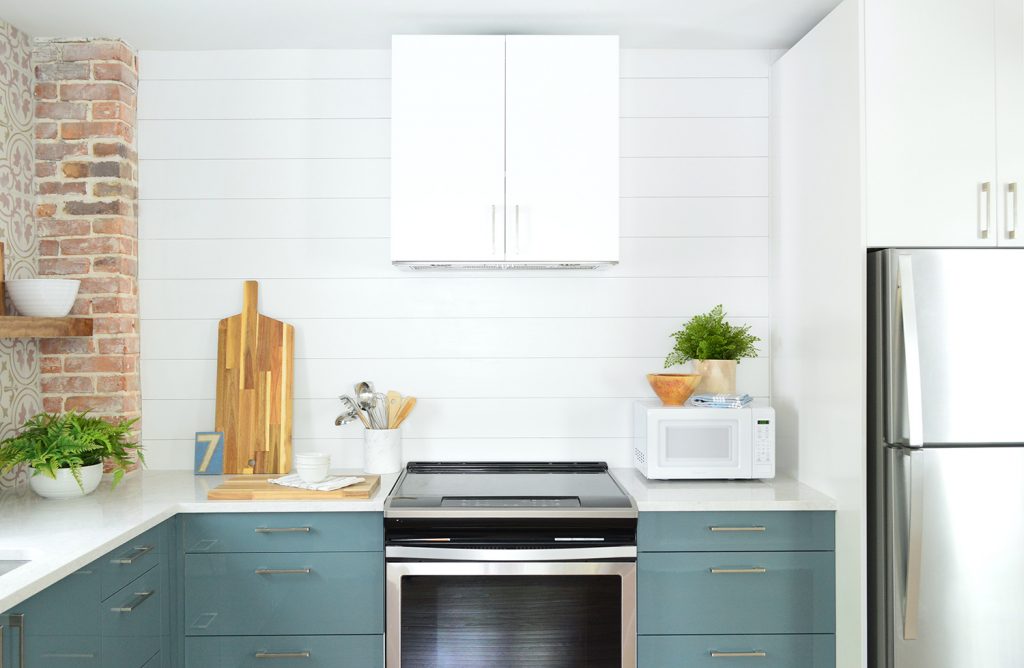
I’ll share a photo tutorial of it soon, but it’s basically just thin pieces of plywood we cut down to planks, nailed to the wall with small spacers, and painted with durable and easy-to-wipe semi-gloss paint (we color-matched it to the the cabinets so everything blends). We think it’ll provide a more durable and stain-proof surface than plain painted drywall – like how people add beadboard backsplashes – and it was so cheap & easy to do. 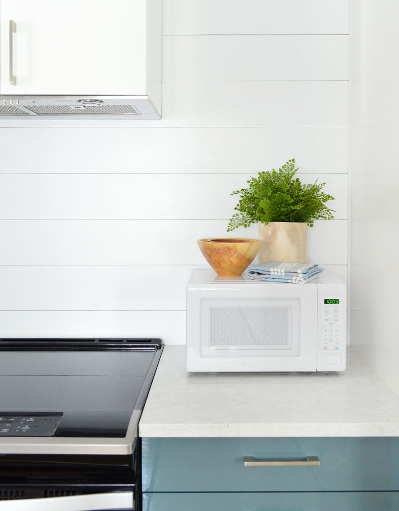
And while we’re looking at the appliances, you can see how we chose stainless for the slide-in range and refrigerator, but went with a white countertop microwave so it blended right into the white wall behind it. 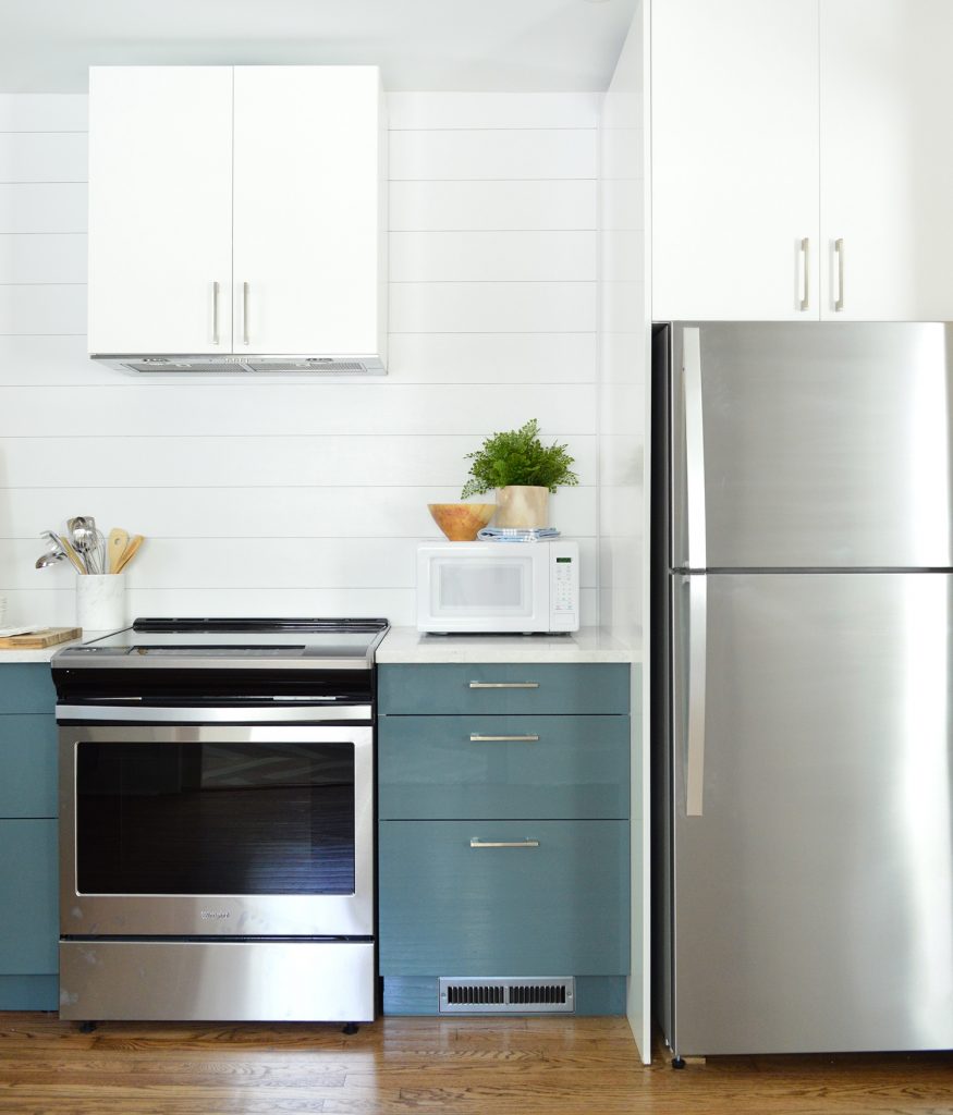
I know some people have been curious about the exhaust hood over the range so here are the details. We decided to give one of Ikea’s range hoods a try because we wanted something that looked completely built-in like cabinetry. So the hood is just an insert they sell that automatically comes with all of the materials and instructions to build it into a standard Ikea cabinet. The only thing you need to figure out is how it vents. Since we can’t vent outside (due to the central firewall required in a duplex) we chose their option to add charcoal filters that clean & recirculate the air. That’s the reason we left the tiny gap above the cabinet instead of adding crown up there. The charcoal filter traps the greasy stuff at the bottom of the hood, but the clean air still needs a spot to escape, hence that little crack up top. 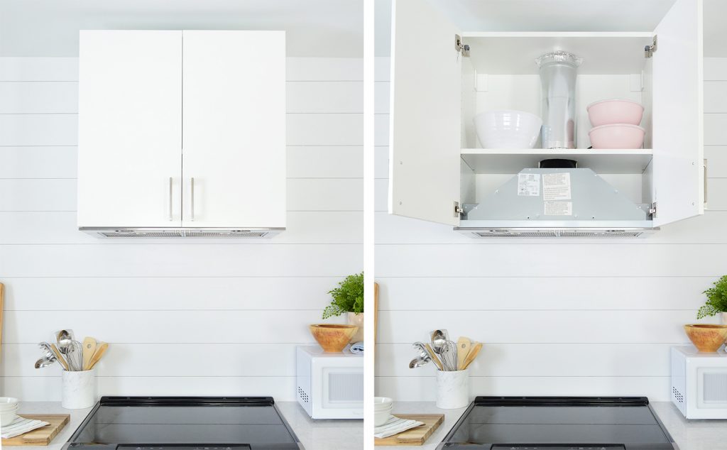
For the fridge we chose a not too fancy but still nice looking top freezer model. It’s not quite counter depth, but we were able to build it in with a side panel so it looks nice and unobtrusive. We were also sure not to buy one with an ice maker or water dispenser because both of those can break or cause leaks (when we lose power in Richmond our ice maker leaks onto our wood floors – ACK! So we don’t want to worry about that in a house that’s vacant in the off season). It may seem minor, but we’re trying to minimize/eliminate maintenance issues wherever we can – even the little ones. And we’ll leave ice in the freezer and a Brita filter in the fridge for renters, so they’ll have cold water & ice on hand. 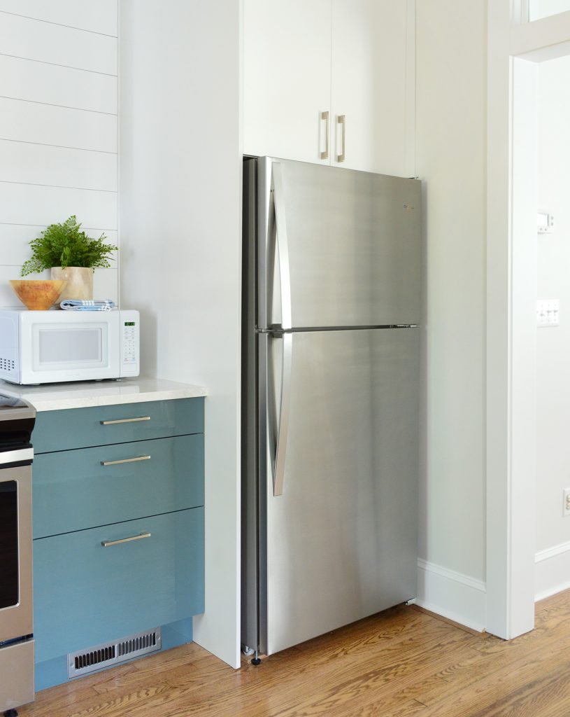
If you were scratching your head wondering where the dishwasher is, well well well, look what we have here: a built-in, cabinet-fronted dishwasher! The first we have ever done! And we love it. We really didn’t want to interrupt that line of cabinets against that back focal wall, so we crossed our fingers that this would work – and it did. Our plumber installed the dishwasher but we added the cabinet panel & hardware ourselves, which really wasn’t hard at all. It does take some careful measuring (they provide a helpful paper template to eliminate the guesswork) but overall it was very straightforward. 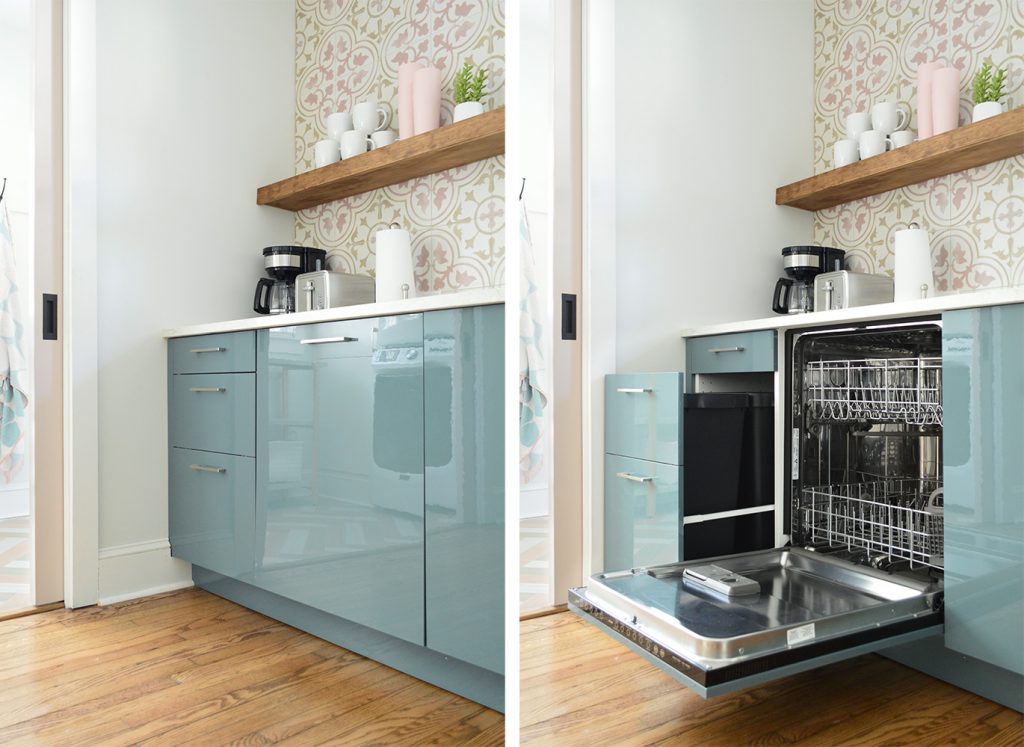
We also have built-in trash cans on the far end of that back wall. Ikea allows you to customize these, so we were able to match the look of all of the other 3-drawer cabinets in the room, but the bottom two are actually one big pull-out. The floating shelves are another thing you haven’t seen yet, and another thing that I’ll write a tutorial for in a future post – including how we drilled through the tile without disaster (it. was. nervewracking.) along with how we built them ourselves to custom-fit the space. We pretty much followed the same technique that we used forthese floating shelves in our bonus room, but they’re a little thicker and more heavy duty so they can support tons of bowls and mugs and cups. 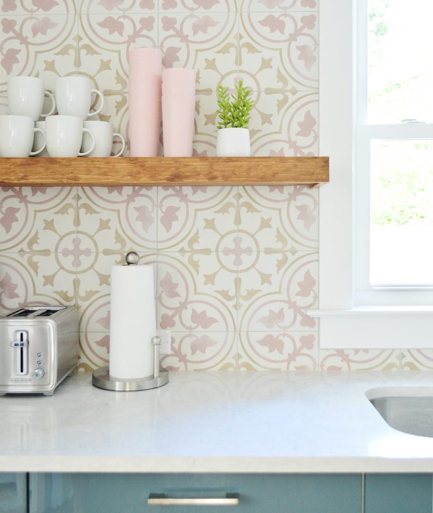
Sherry stained them “Special Walnut” by Minwax, which is the same color we used for the floors throughout the house, so they tie in nicely and add some warmth and sort of an older/original vibe with the shiny new cabinets.
Okay, so now we’re back on the other side (the side with the green-y blue doors throughout). The kitchen layout is exactly the same on this side, just flipped, but the finishes and colors are different. So for example we have brass hardware in here, the shelves are a different color, the cabinets and backsplash are different, etc). 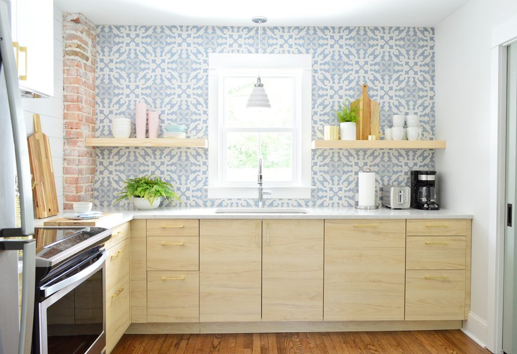
This is what this side looked like before, as seen from the living room. That window in the way back is the one that now sits over the sink. 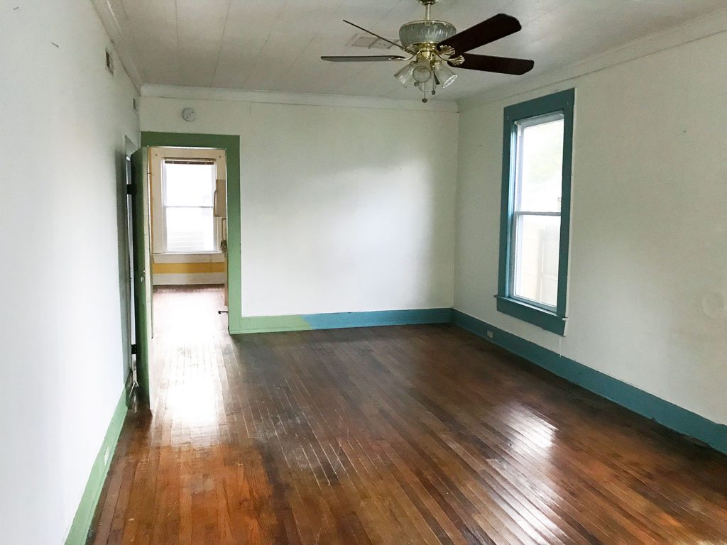
Once again, widening that doorway and adding the transom really opened up this space in a major way. That kitchen window gets some of the best light on the first floor, so in person you can really appreciate how good it feels to have these rooms more open to each other. 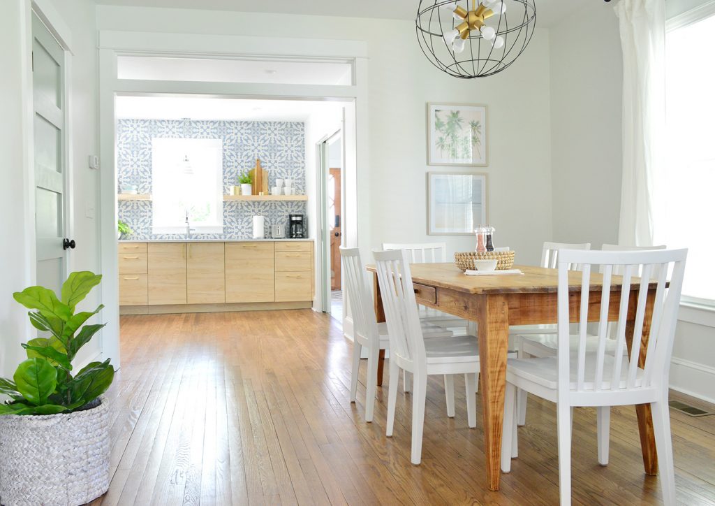
This is the best before photo I could find of the now-kitchen itself. Apparently we were so distracted by the former kitchen (again, now the mudroom/laundry room) to take any good shots of the adjacent space. But it was basically just a big yellow room with a rando fridge in the middle of it. And some faux greenery… which I’m not knocking because faux greenery is basically our love language these days. #Foreshadowing 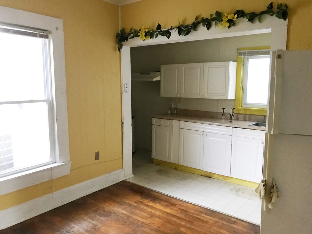
And here is a similar view today. You can see that we actually shifted/narrowed the opening to our now mudroom/laundry room a little (and added those pocket doors) in order to create some wall space for the cabinets to terminate into.
When I was talking about how we built our shelves, I should have mentioned that we designed them to be 8″ deep, which is intentionally too narrow for heavy items like large plates or bowls. We know some people don’t love the idea of open shelves because they worry the items might get dusty, so most of the actual serving stuff (bowls, wine glasses, plates, etc) are still stored in the cabinets. These are just a nice place for smaller overflow things like measuring cups and cutting boards and tea mugs that are often kept out on a rack or a counter anyway – along with some decorative things like vases/plants. 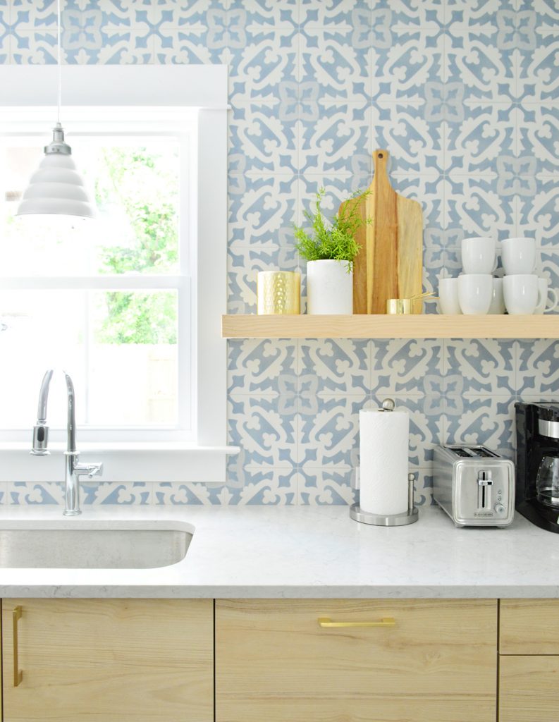
We lucked out that the pine we purchased to build these shelves was VERY similar in color to the Ikea cabinets that we chose. So instead of staining them, we just clear-sealed these so they’d echo the blonde cabinet color. In these pictures they don’t look as identical as they do in person (when you look at them in real life, they’re so similar it feels like they were sold as a matching set). 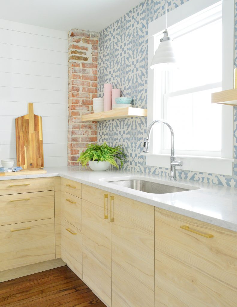
As for what else is in the cabinets, we’re thinking we’ll film some sort of “cabinet tour” once we’ve got everything fully moved in an organized. We ended up with a similar number of cabinets to our beach house kitchen, so we’re going to mimic a lot of the systems in there. Plates and flatware will go in the cabinet next to the sink. The drawers flanking the stove will get pots, pans, and other cooking stuff & servingware. The lesser used storage items will go in the upper cabinets, and we’ve got pantry storage in the adjacent mudroom/laundry room. 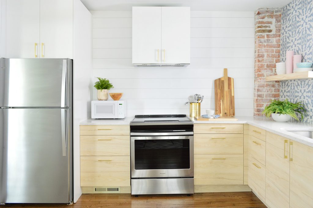
The smaller number of cabinets in here might not fit every possible gadget that someone might want to have in their full time home (especially a super chef-y person), but we love knowing that we have all of the basics covered with THREE CABINETS/DRAWERS TO SPARE. It’s nice to know there’s room to grow if we forgot something – but there’s already a ton of stuff in here (including things like ziplock bags, cooking oil, pyrex, a spaghetti strainer, soap & cleaning stuff, a vegetable peeler, an ice cream scooper, etc, etc, etc). 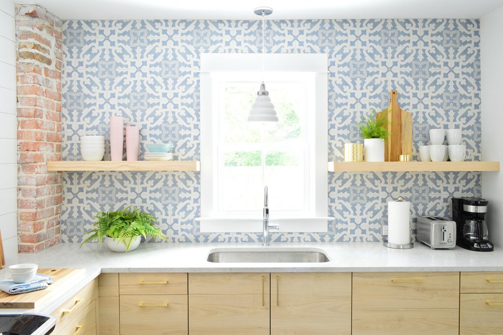
We’re hopeful that next week we’ll have photos of both fully finished mudroom/laundry rooms for you – plus give a peek at how our little twin bed sleeping nooks turned out. And by that point I think you’ll have pretty much seen everything except the backyard, which is still in progress.
And if you’re someone who has been thinking about renting the duplex, we’ve listed each side separately, so here’s the Left Side (with the pink doors) and the Right Side (with the blue doors). Each side sleeps up to 6 people (plus one baby – pack ‘n play & sheet provided!). If you’re interested in booking both sides at one time, just check the availability and book each of them for the same dates and the whole house is yours! 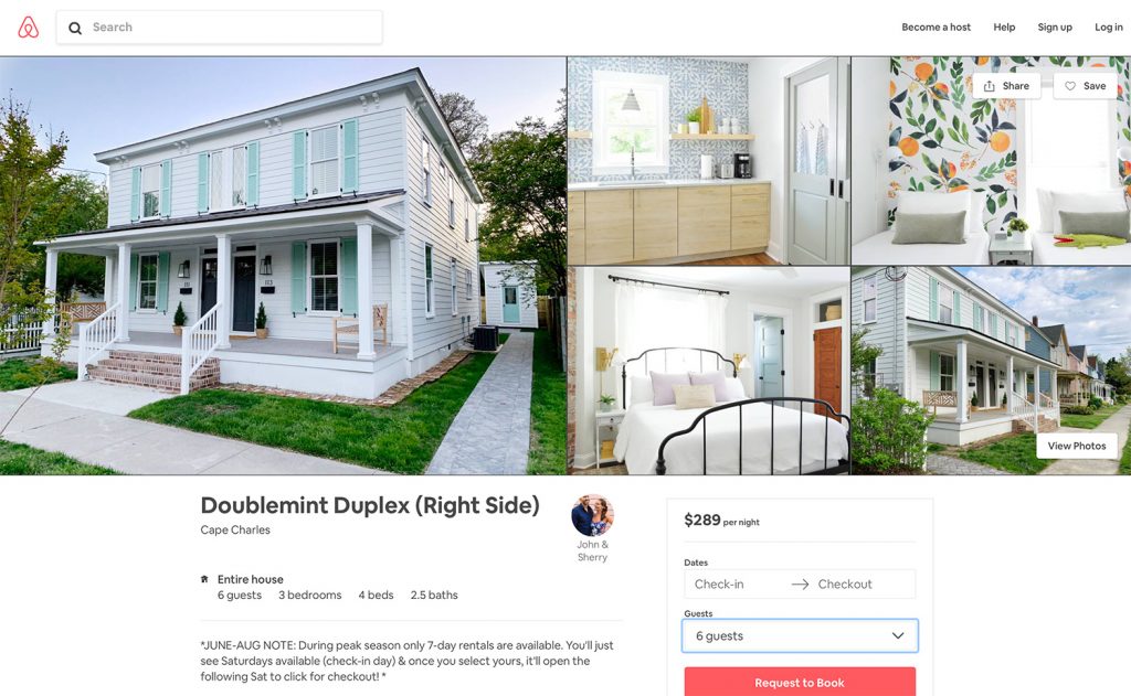
Right now we’re only offering weekly rentals for the peak summer season ((Saturday to Saturday, late June through August). We plan to offer shorter off-season rentals in the spring/fall too, but we’re warming up by renting for the summer season first – since we’ll be nearby at the pink house if an issue pops up. If you’re looking for something shorter than a week this summer, places like Hotel Cape Charles, The Northampton Hotel, and Bay Haven Inn offer nightly rooms for around $220-260. And as much as we love our dog, these rentals won’t be pet-friendly. We’re just trying to be extra sensitive to allergies and noise, especially considering that this is two homes with a shared wall.
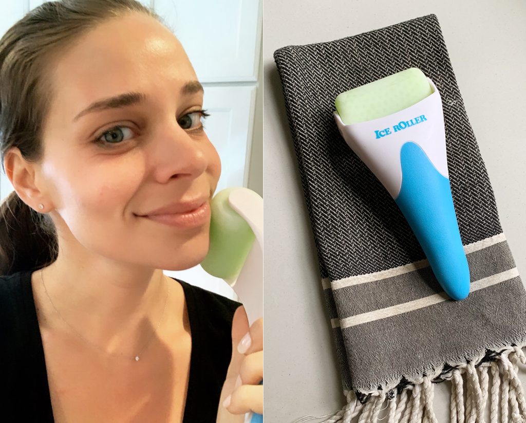
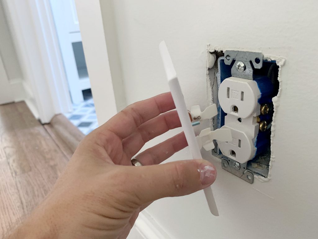
It’s exciting (and nerve-wracking!) to finally open this sweet house up for reservations, so please bear with us as we work out any kinks during our first go at a short-term vacation rental. You know we’ll tell you everything we learn. And oh boy do we expect there to be a learning curve! You can also check out our Cape Charles Travel Guide that we posted last year if you’re curious about what there is to do/eat there. Since we’ve written that, more shops have popped up – like a few new bakeries and even an escape room that’s coming! P.S. You can see all of the other finished rooms of the duplex that we’ve already revealed along with how we tiled the bathrooms, planned the layout, and screamed into a pillow when the review board denied an architectural change we were dying to make here in our duplex category. *This post contains affiliate links* The post Two Duplex Kitchen Reveals – And Our Airbnb Listing Is Live! appeared first on Young House Love. Via https://www.younghouselove.com/duplex-kitchens/ Home improvement can be stressful, and we’re no strangers to that tension leading to some pretty memorable arguments. So today we’re looking at some data about what do-it-yourself projects cause the most issues between couples to see if we agree (and we share a recent fight we had in the name of data). We also reveal some takeaways from a recent house staging project that we took on together, including the big secret to getting your home ready to sell and how you may have to unlearn everything you know about decorating. Plus, John falls for another lighting product, Sherry ups her face game, and we see if people really do hate textured walls after all. You can download this episode from Apple Podcasts, Google Podcasts, Stitcher, TuneIn Radio, and Spotify – or listen to it below! Note: If you’re reading in a feed reader, you may have to click through to the post to see the player. What’s New
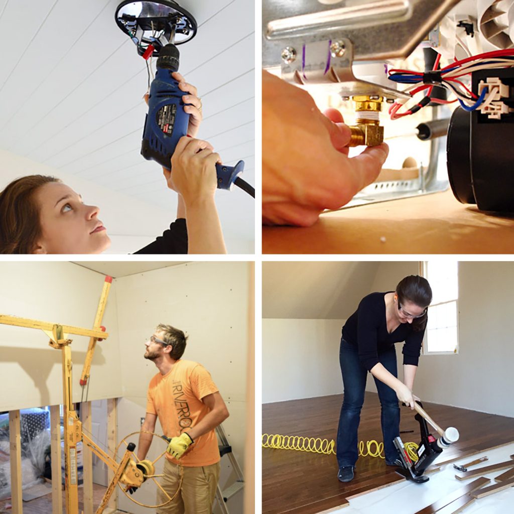
Game: DIY Fights

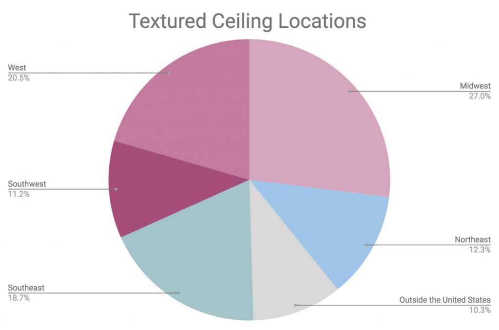
Update: Textured Walls

We’re Digging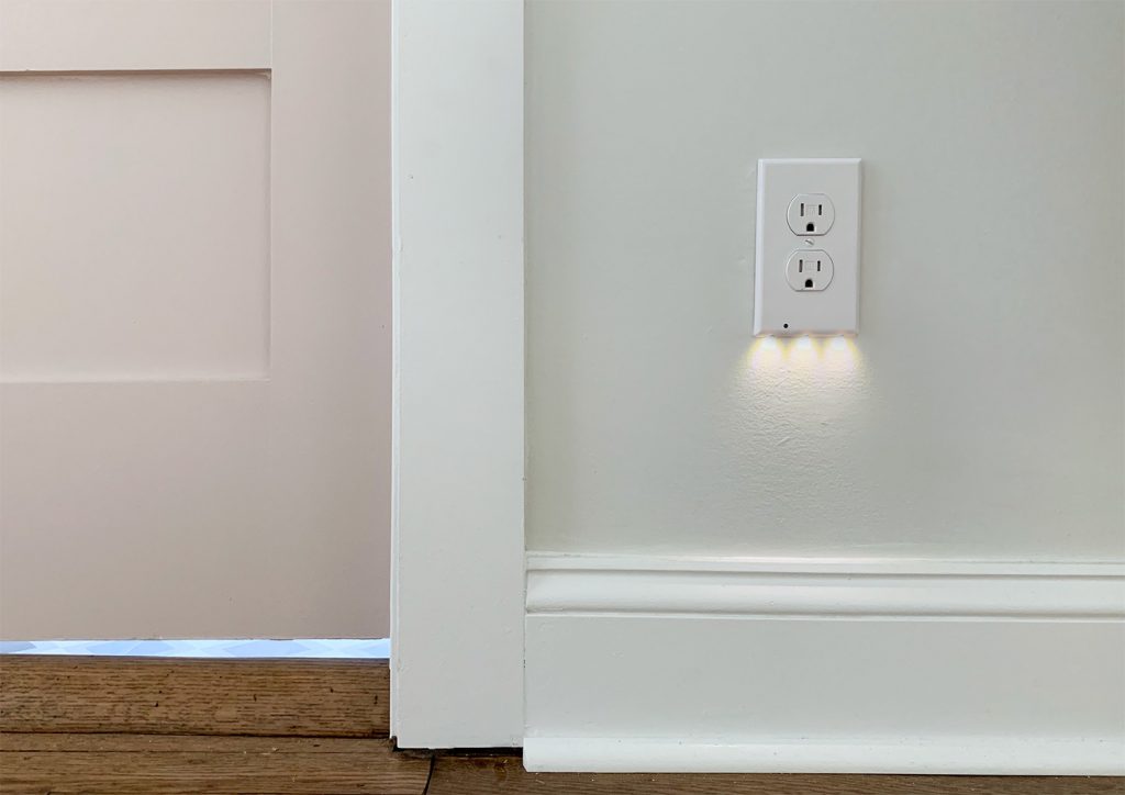
If you’re looking for something we’ve dug in a past episode, but don’t remember which show notes to click into, here’s a master list of everything we’ve been digging from all of our past episodes. You can also see all the books we’ve recommended on our Book Club page. And lastly, a big thank you to Grove Collaborative for sponsoring this episode. Sign up at Grove.co/YHL and spend your first $20 to receive a FREE gift: a trio of Mrs. Meyers cleaners, a 60-day VIP Membership AND a surprise bonus gift on top of all that. 
Thanks for listening, guys! *This post contains affiliate links* The post #140: The Most Fight-Inducing DIYs Out There appeared first on Young House Love. Via https://www.younghouselove.com/podcast-140/ |
