|
Earlier this month we took the whole family (dog included!) up to Brooklyn for a few days to put together the space we’ve be designing for this year’s Real Simple Idea House over the past five or so months. I realize there’s a lot to unpack in that sentence (especially if you missed our podcast episode or Instagram stories about it) so we’ll catch you up right here and show you the *almost* finished space. And explain what’s still left to be done before their big photoshoot for the magazine and tell you about how some last-minute curveballs actually made the room better. And tell you what they do with everything in the house once the idea home is all said & done. That’s a lot of ands, so buckle up because we have a lot to tell ya. 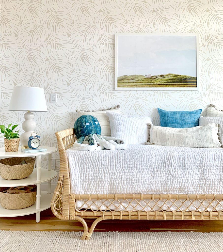
This is the second year that Real Simple magazine has taken over a home in Brooklyn, assigned each room to a different “designer” (there’s typically a mix of certified interior designers & bloggers & design TV personalities, etc) and then they photograph the finished spaces for their magazine (this one will featured be in their October issue). Here’s last year’s house which we loved following along (especially since our friends Jenny Komenda & Sabrina Soto each got a room in that house. We were completely surprised & extremely thrilled when they asked us if we wanted to do a room this year – and they assigned us the “guest room/playroom” – which felt just perfect for us (we love multi-function rooms, especially when it involves balancing the needs of both grown-ups and kids… even if the family is imaginary in this case). 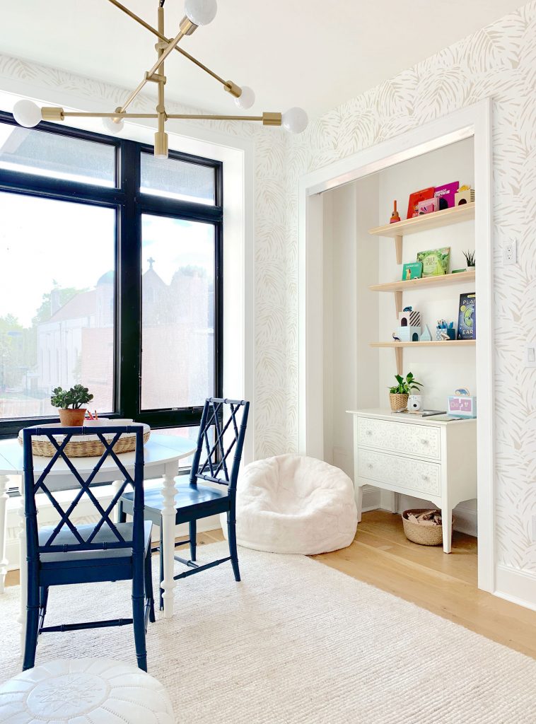
So since March we’ve worked remotely with the Real Simple team to make this room happen. They sent us pictures (like the one below) and measurements and floor plans, we sent back design plans and a mood board and a floor plan and links to each product selection. Everything had to be approved by their editors (they didn’t want a certain space to feel wildly incongruous with any of the other rooms and they also didn’t want duplicate or too-similar items or ideas from space to space) so it was a fascinating puzzle to put together from afar. Once everything that we ordered had arrived in the room, we spent one marathon day putting things in place and navigating some 11th hour challenges that are inevitable in these types of projects. We didn’t get EVERYTHING completed (most notably our long white curtains were back-ordered so they’ll go up later – which will completely soften that industrial back wall so it looks a lot more like the rest of the room) but it’s around 95% done in these pictures, and the Real Simple crew will get it to full 100% before their photographer comes in. 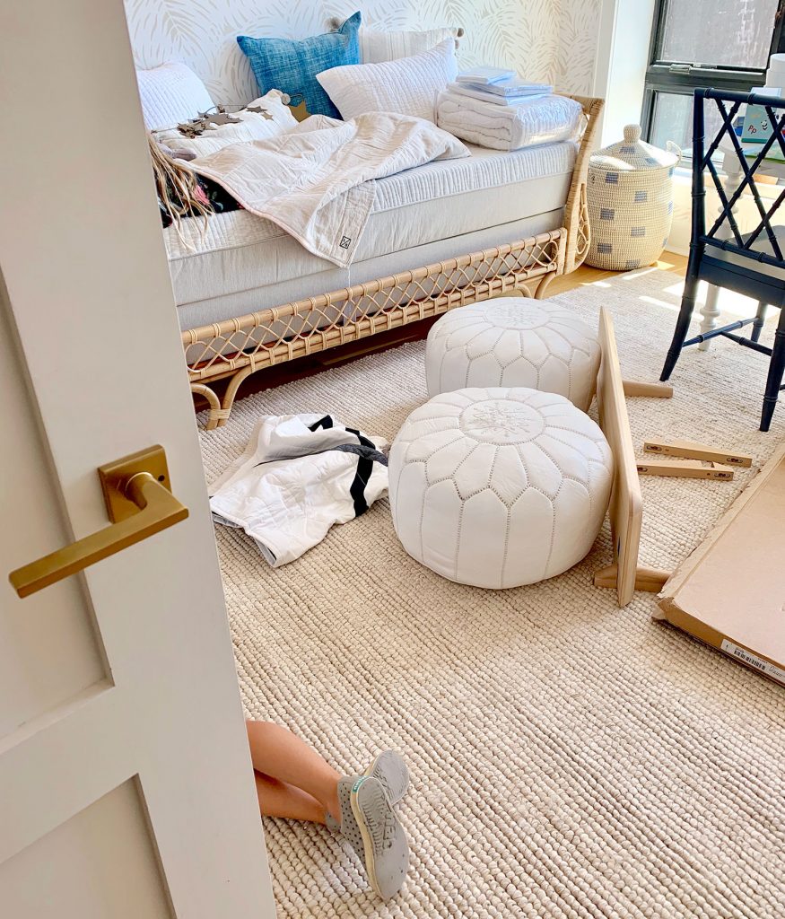
And yes, those are our son’s feet poking out in the picture above and our daughter is laying on the bed under a blanket. We decided to make this a big family trip – mostly because we wanted to see relatives and friends in the NYC/NJ area while we were up there, but also because we thought it’d be fun for our kids to see us tackle this firsthand. It was basically one big “take your kids to work” adventure, and they both got into it and started suggesting what they’d like (our daughter even sketched out some ideas on her little magnetic drawing tablet), and they both served as “quality control” to make sure the beanbag was comfy and the rug was soft enough to roll on. In short: it was a ton of fun to have them there. In any of these combo rooms, there can definitely be a range of percentages when it comes to the balance. For example, sometimes people have a playroom with a futon in it and it’s 95% playroom, and 5% guest room (that futon is literally the only guest room-ish thing about it, and it’s used very rarely). 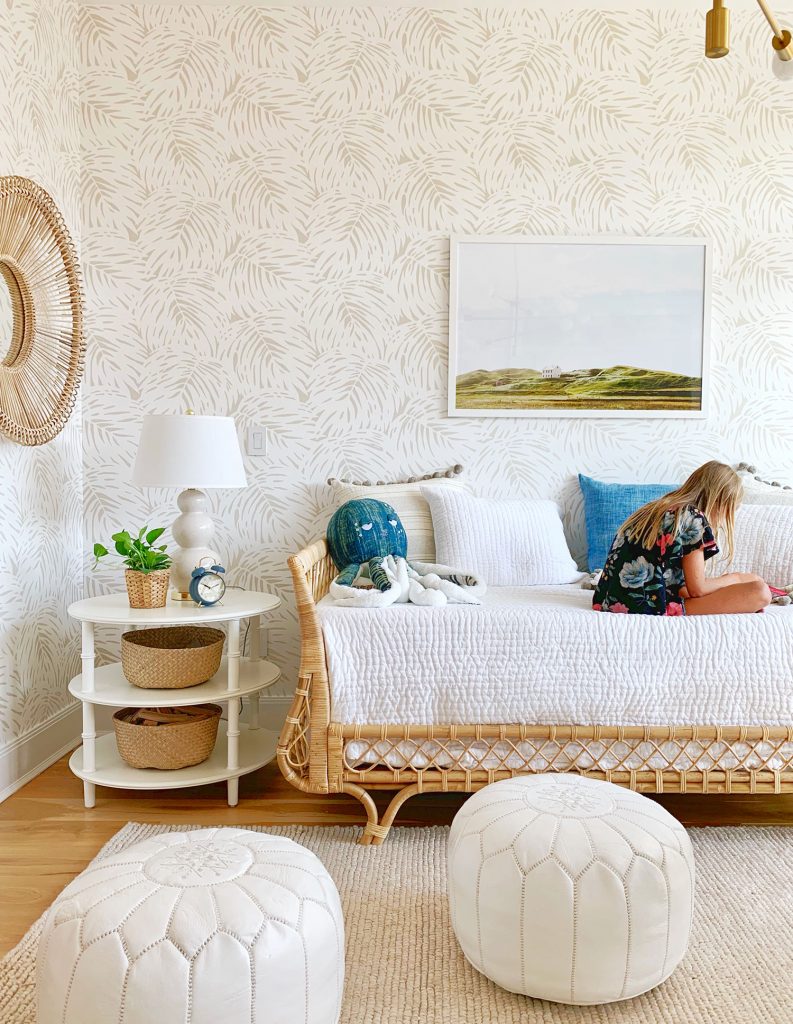
In this case, the brief from Real Simple was to make it look mostly like a guest room, so any grown up would walk in and love it and want to sleep there, but to also work in some kids stuff – both hidden (in storage bins, baskets, behind closed drawers, etc) and on display (on open shelves, in lidless baskets, etc). So I’d call this room’s particular percentage 75% guest room & 25% playroom. When you’re tackling a multi-use space like this, do whatever percentage actually works functionally and feels right for your home (remember, this is an imaginary family). As for pulling this room’s design together, I’ve been obsessed with this daybed for years, so it was the launch point for the whole room as soon as Real Simple said that a single bed was their preference for the space. Picture me punching the air and screaming “I GET TO USE MY DREAM DAYBED!!!!” 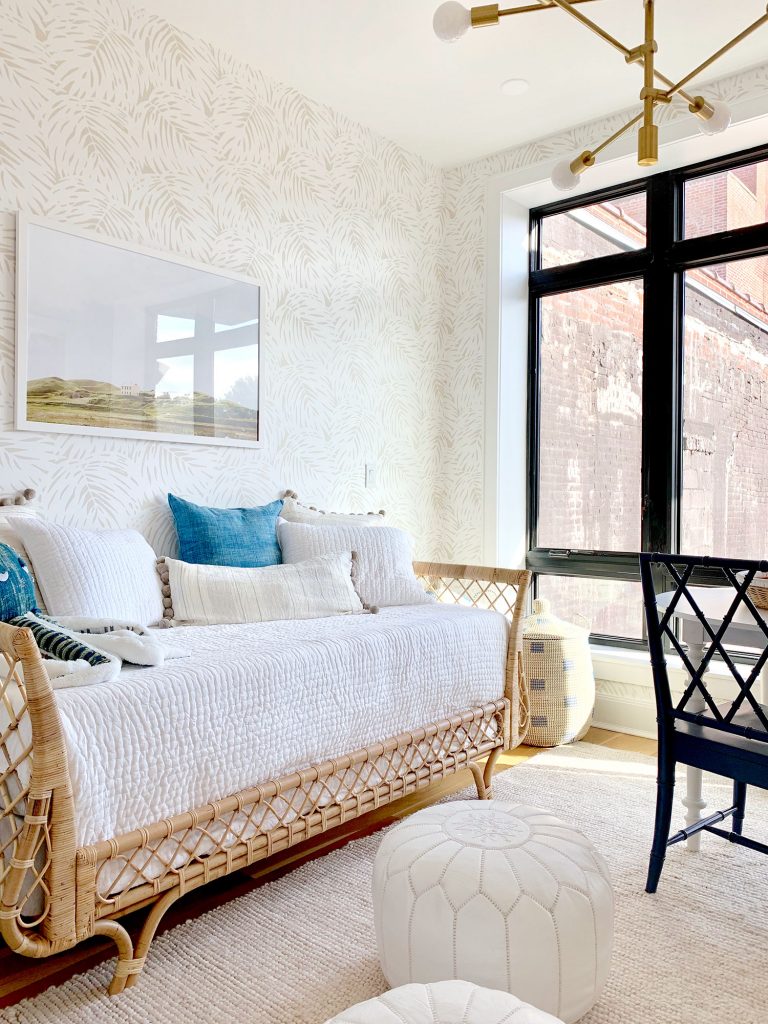
Daybeds are also great because they can function as both a bed (when it’s in guest room mode) and a couch (when it’s in playroom mode). We also balanced some other needs for both functions with some other furniture choices. A nice big side table with books & mags for a guest along with a reading lamp checks the guest room box, while some large lidded storage baskets on the other side of the bed checked the playroom box (see photo above). The wallpaper was also sort of a happy accident too. The original wallpaper we had suggested was also very tone-on-tone and I had picked it because I LOVED how playful the pattern was (look how cute!). Since it was still an extremely neutral color palette, but the pattern was fun for kids, I thought it would be perfect for this dual space, but the editors worried it might skew too playroom so we selected this more affordable palm one instead. We love how the room turned out, but I still love the original wallpaper pick too – so if you’re creating a playroom or a kids room, I think it would be so much fun (heck, as a grown woman I’d like it in my space too). 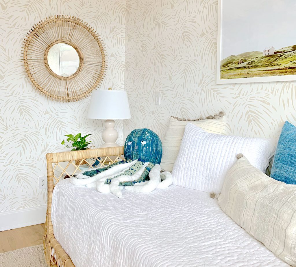
I am just in love with that octopus, as were the kids. What is it about a big stuffed animal with a slightly dopey expression that steals your heart? Also, some of our pillow fills hadn’t arrived yet so that droopy bolsterpillow below is stuffed with spare bath towels. THE MAGIC OF PHOTO STYLING, EVERYBODY! Also this large print from Juniper Print Shop was such a perfect solution (all the right colors, looked great with the wallpaper, and feels like a kid would love staring at it just as much as a grown up – in fact our kids asked us whose house it was – ha!). 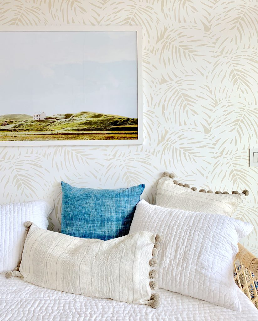
Another playroom “must” for us is a table or desk that can serve as a craft/art/game space. This room had very little wall space (aside from the bed wall, it was pretty much all windows, closets, and doors) so we knew a floating desk or table was our best bet. A round table is always great in these scenarios and we knew our drop-leaf table would earn bonus points because the leaves can be folded down to make it more compact if needed. Plus there’s room for two blue-gray chairs that can be moved to any of the four sides of the table. Flexible furniture is always a win. So we just hoped when we showed up that we could make it work, and we love how it looks by the windows. Imagine coloring or doing a puzzle there while looking outside on a gorgeous sunny day. Please also imagine my double wide white flowy curtains because all of that industrial black frame that you see below will be muuuuuch softer once they’re hung. I can’t wait to see the photos from the magazine because it’s going to be yet another demonstration about how curtains completely change a room. Stay tuned… 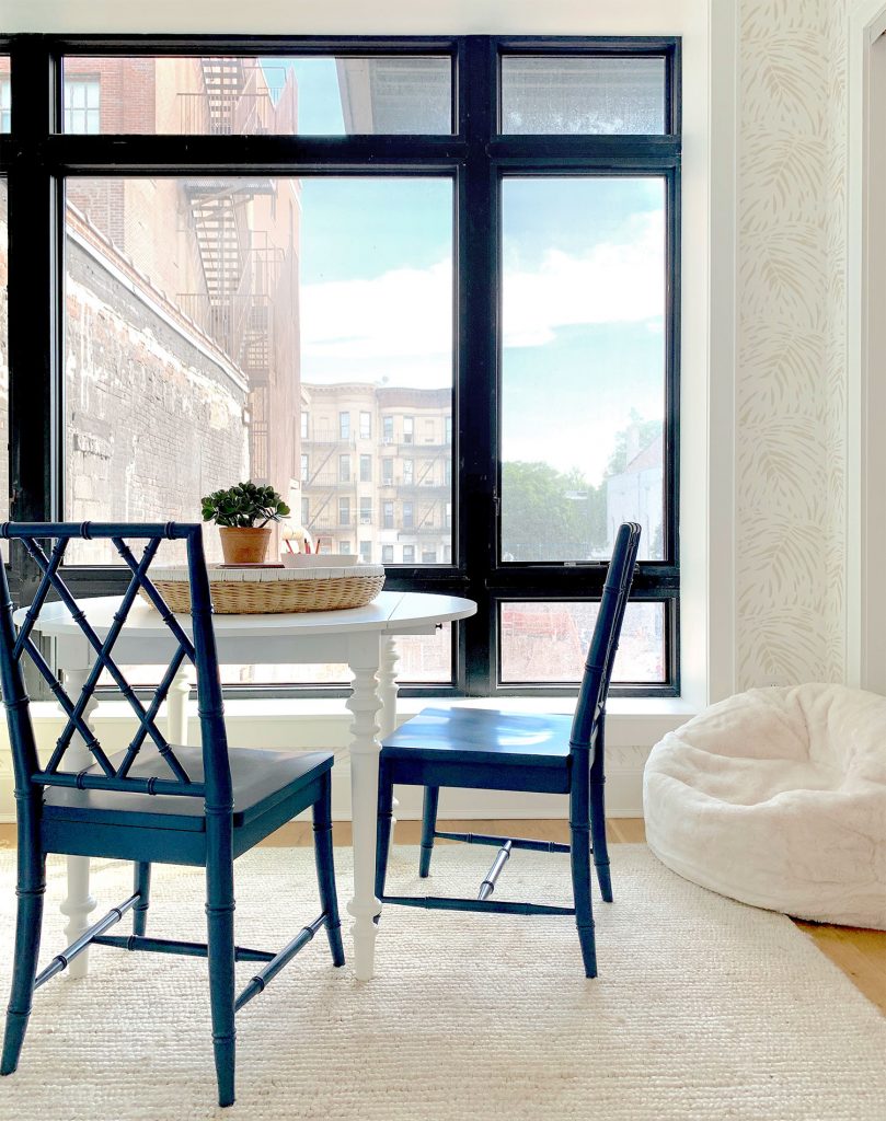
This room is also great because it had two matching closets along the wall to the right of the window above. Why is that great? Well, it was a no-brainer to make one useful for guests (their clothes, a suitcase, etc) and use the other one for kids storage (games, books, art supplies, etc). The guest closet is being outfitted byprofessional organizers (they’re doing pretty much every other closet in the house too, as well as the pantry) so our task was to tackle the kids closet, which we wanted to make open and accessible – and cute enough to be in plain view 24/7… so our first step was to remove the sliding doors. I realize that “doors off” approach could sound counterintuitive since the fastest way to clean up for guests is to just throw stuff behind closed doors, but we’ve found that can also breed Monica closets (especially when toys are involved). Plus this is an idea house… how fun would this room be if we just had kids stuff hiding behind a closed door? So instead, we got to create this little nook full of functional storage that looks good too (the stenciled dresser is such a great piece that’s easy on the eyes yet super smart for storing things out of sight). 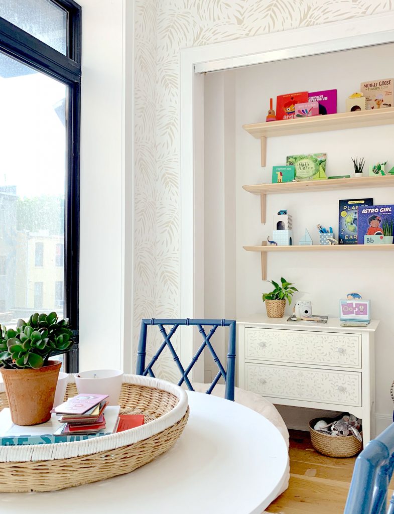
So at least consider creating some storage like this in your home, which can fend off the urge to shove everything into a closet, and instead create a manageable and simple system for things (both concealed and out in the open) so that you love looking at it. When everything has a legit spot to go back to after it’s done being played with, it really isn’t very hard to maintain (and even kids can clean up on autopilot). Another example of this concept is the back wall of our bonus room in our house, where we have concealed cabinets for storing games and art supplies and puzzles and even bonus guest blankets and pillows for when people sleep in there, but also has fun open shelving so you walk in and see some playful and very functional items right out in the open. 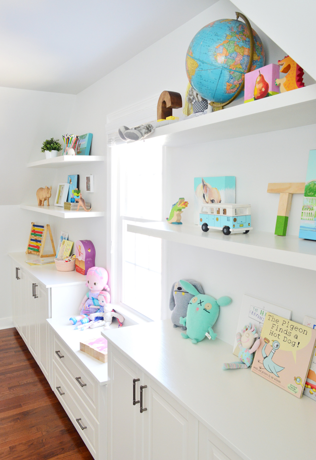
But back to the idea room. These shelves were actually our biggest hiccup in the plan, and they’re what ended up taking up the biggest chunk of time during our install day. Our original shelves were backordered, but we didn’t find that out with enough time to order new ones. 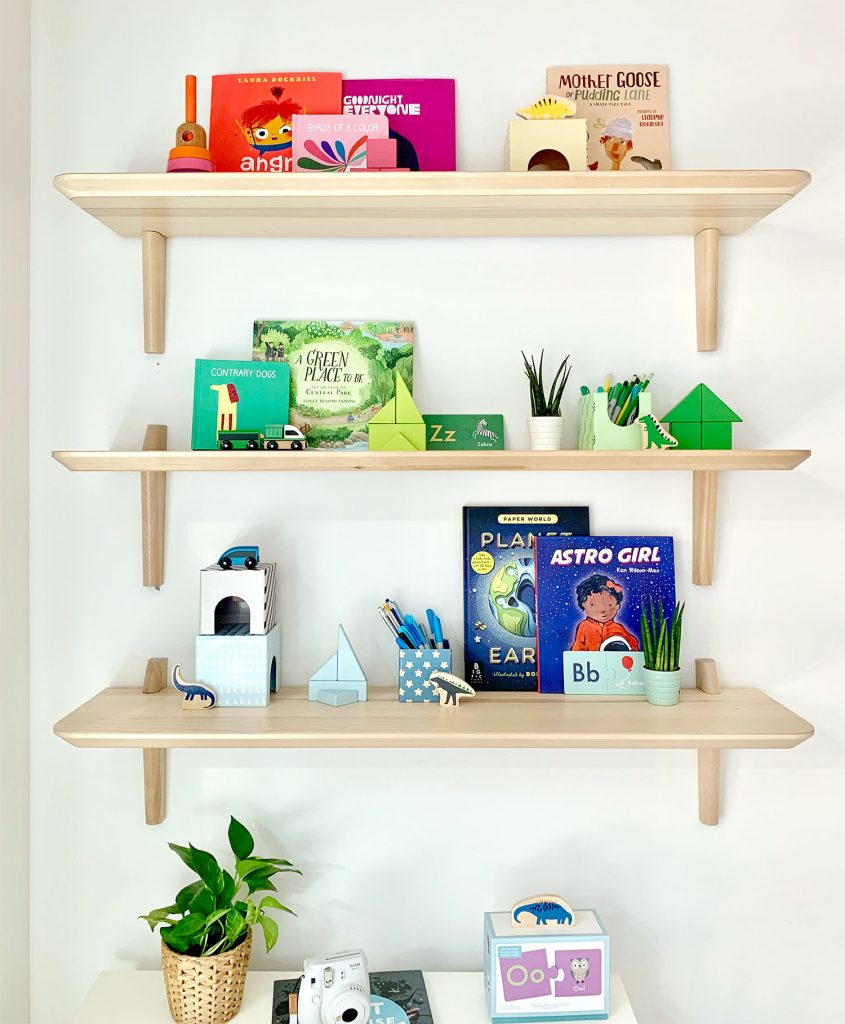
Originally we were going to do colorful shelves full of books & toys, but physically being in the room that day made it clear that this wall needed some wood tones to balance out the daybed and the other lovely wood tones on the other side of the space. HOORAY FOR THE COLORFUL SHELF DELAY! It truly was the best hiccup we could have asked for, because these wood shelves made the room turn out so much better than it would have if those hadn’t been backordered. After we arrived, we immediately began hunting for options that were in stock and available that day, and landed on these LISABO shelves from Ikea. And there was an Ikea like 15 minutes from the house in Brooklyn so we were able to have them in hand by lunchtime! 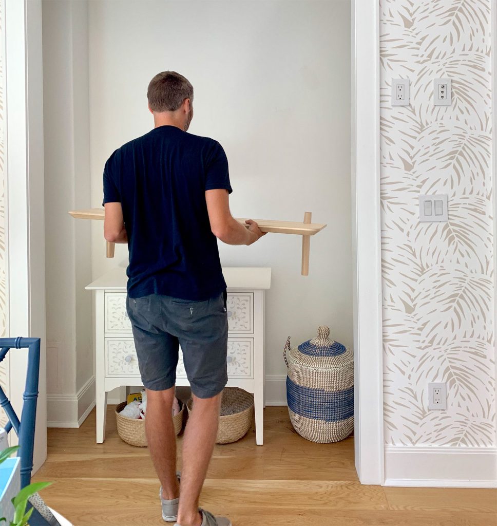
We filmed a whole segment with Real Simple about hanging the shelves (who knows if we were coherent enough for them to use it but we’ll share it if/when it comes out), and you can see that the more neutral shelves still ended up looking colorful and fun, thanks to the addition of some toys and books and blocks. And I know the idea of color-coding your shelves can be eye-roll inducing, but it ended up being great for this tiny space. I wasn’t super Type-A about it. I just quickly tossed things together mostly by color… but there’s yellow & pink in that top right corner and orange & hot pink in the top left, so it’s not anything that took too long or was overwrought.
In fact it took us about 1.5 hours to hang these shelves (two words: cinderblock walls) but it took me like 9 minutes to style them. Not kidding. And the cool thing is that as people use items and kids grow and change, shelves evolve too. Open shelves aren’t a museum. Nobody has to painstakingly put things back the same way each time. It’s actually fun to try different groupings, and this rainbow-ish approach made our eyes happy, but the shelves in our bonus room have changed so much over the years. It’s all gonna be ok. Don’t stress. Just put things you like to look at on open shelves and hide stuff you don’t wanna see in concealed cabinets or drawers or baskets or bins. Truly, it’s a simple system that you can actually can keep up with. A note on the shelves themselves, because they exceeded our expectations by like a million. I had never personally heard of or seen these shelves before (they said “new” on the Ikea site when John dug them up on his phone in that panicked we-have-to-find-something-today search) but I’m SUPER impressed by them. They’re very solid, relatively easy to hang (would’ve taken about 10 mins per shelf if we didn’t have cinderblock walls which required a masonry bit), and the wood tone is perfect. Blonde and casual. Smooth & expensive looking. But not. 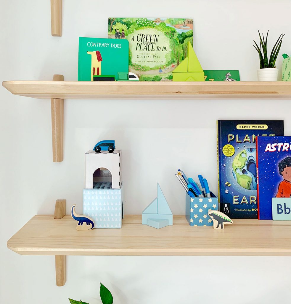
And since we know keeping picture-perfect shelves isn’t realistic for all of your toys, we always like to incorporate some closed toy storage too – like the chest of drawers underneath the shelves and those large floor baskets across the room that we mentioned earlier. Oh, I also think we need to buy a beanbag now. Our kids were obsessed with this one. Like the chairs were chumps. They both wanted to be ON THE BEANBAG AT ALL TIMES. 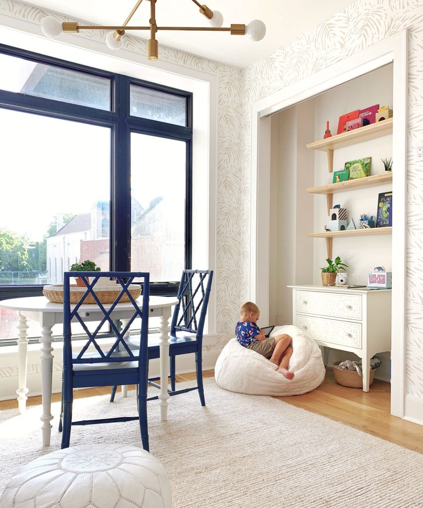
I’m so excited to see the finished pictures of this space in Real Simple’s October issue. Plus there are so many other amazing spaces that we already got to see in various states of near-completion, like Mandi’s master bedroom and Shavonda & Carmeon’s office. Speaking of which, we overlapped Shavonda and Carmeon‘s visit and it was SO. MUCH. FUN. to finally meet them both in person. We’ve been IG buddies for ages (you might remember that Shavonda talked to us about downsizing on our podcast last year) so hanging with them was the perfect end to an extremely fun day. Plus Shavonda got this sweet picture of me and John where we look like we’re wearing one large black t-shirt with three arm-holes. If that ain’t marriage, I don’t know what is. 
Oh, and as for what happens to all of this stuff and this house when the photos are taken for Real Simple’s October issue… well, the house gets sold and the furniture gets auctioned off for a good cause! I love that nothing goes to waste, and in creating such a fun space, everything ends up benefiting people who need a helping hand. They haven’t picked this year’s charity yet, but when they do I’ll let you know. So thanks, Real Simple! It was Real Fun ;) #MomJokes4Days P.S. If you’d like to see other rooms we’ve designed for a good cause, we loved doing this very special room makeover for a local family, this teacher’s lounge for a local school, and these three bedroom makeovers for three amazing kids. *This post contains affiliate links The post Our Room For Real Simple’s Idea House appeared first on Young House Love. Via https://www.younghouselove.com/real-simple-idea-house/
0 Comments
Many moons ago John shared the beach house before & after photos from downstairs (tons of never before seen angles!) right here in this post. And it has taken us a while (how has it been eight months?!) to get the upstairs before & afters all together so you can see all of those comparisons, and browse the entire second floor of our project, which we are thrilled came together (it was looking ROUGH at the start). So let’s pop upstairs & look around, shall we? Because the transformations were just as big up there… 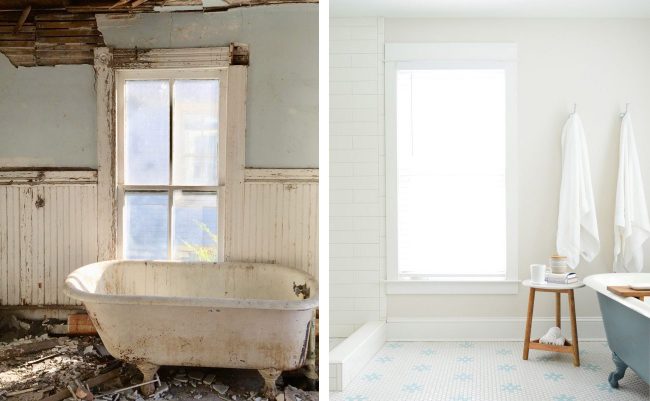
UPSTAIRS HALL & OFFICEHere’s the upstairs hall as you face the front room that we converted into a mini storage room & office. There was tons of water damage, mold, and termite damage throughout the entire top floor. 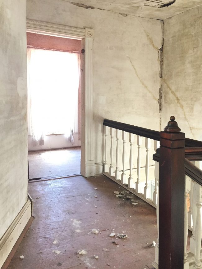
This is the same angle now, with smooth walls and a non cracking ceiling! Makes all the difference, eh?! 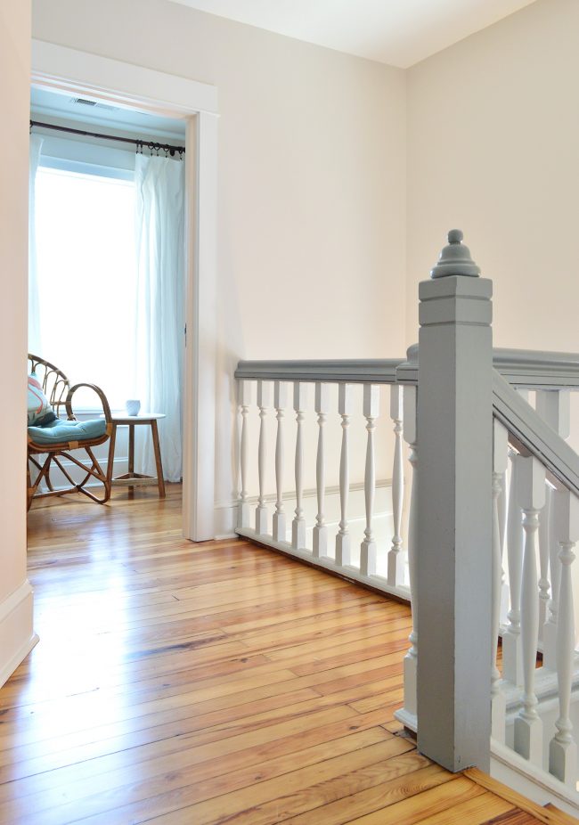
If you take a few steps towards that doorway, this is what the room looked like when we bought the house: 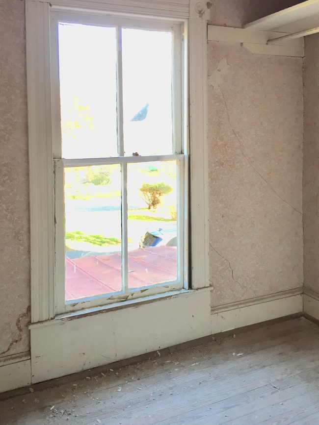
And here it is now that we converted it into an office with the addition of some really simple shelves that rest on brackets (and a very basic desktop that we hung in a similar way). It adds SO MUCH FUNCTION to such a small space (when in doubt, go vertical whenever you can!). 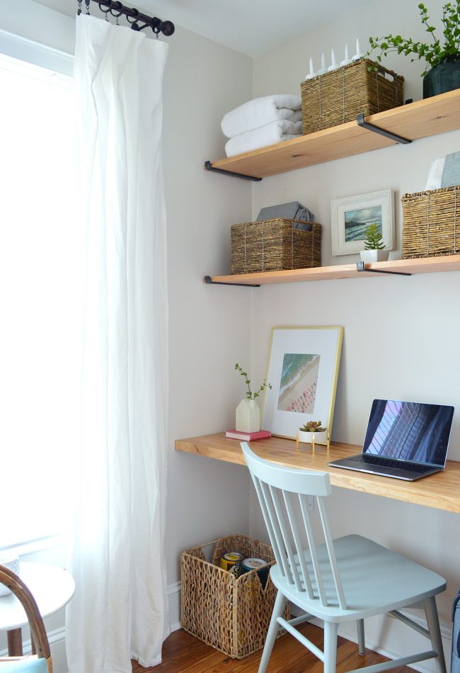
FRONT BEDROOMThis is what the front bedroom looked like when we got the house – we could see potential in that beautiful floor that we refinished, but it was pretty much a blank slate. 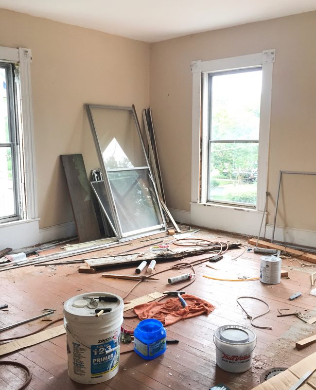
Here’s that room now, all furnished & welcoming for guests. This room gets such great light, so we love putting up friends & family who come to stay. It’s so lovely sometimes I wish it was our master bedroom – but there’s no attached bath. So we have the smaller bedroom in the back & leave this loveliness for anyone who comes to stay with us. 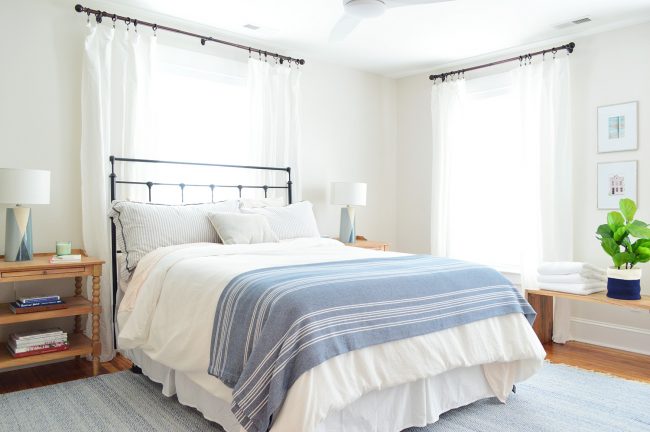
Without a doubt my favorite part is this original chimney that we exposed (it used to be hiding in the wall behind drywall) and this dresser, sconce, and mirror setup that we created (the inlay dresser was my best craigslist score to date!). 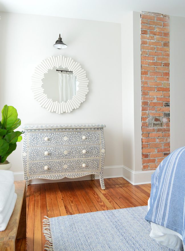
To give you more of an idea about how far back we stripped things at this house, here’s a photo that was taken from a similar angle back before the walls went back up. In order to address all the water damage & ensure everything was structurally sound, we had to go all the way back to the studs – and we patched that hole in the brick while we were putting everything back together. 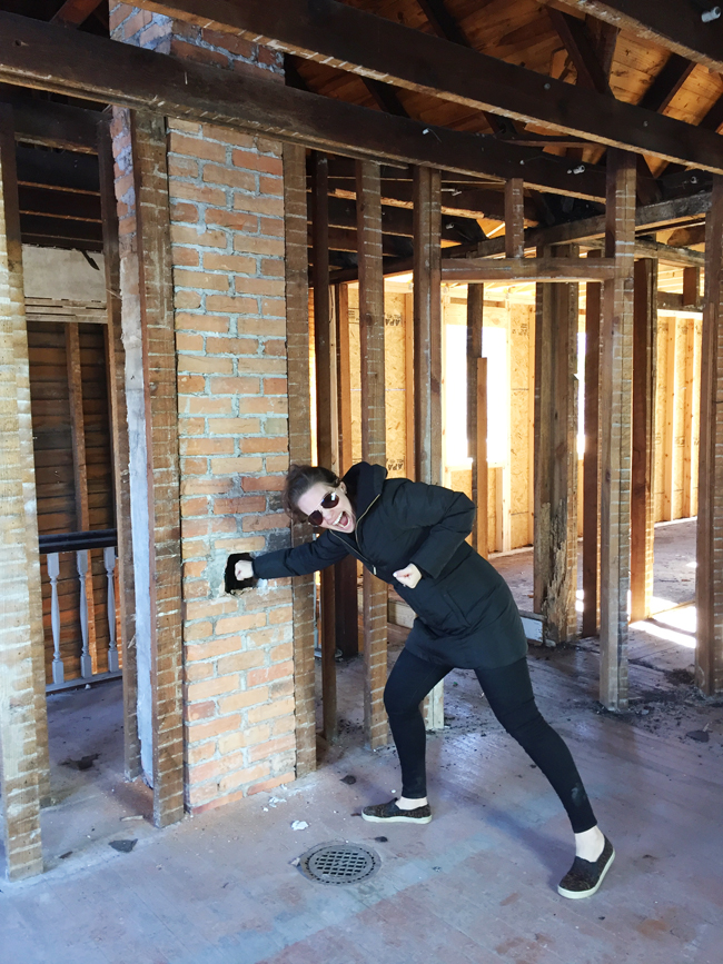
MIDDLE BEDROOMThere was also a middle bedroom that you used to have to walk through to get to the back bedroom (so… zero privacy). We opted to add a central hallway to change that middle bedroom into a fully private room (now people could take the hallway to get to the back bedroom instead of passing through this one. Oh and it came with a very rotten foosball table full of roaches and a ceiling that was literally crumbling onto the floor in a few spots. Not pictured: giant hornet’s nest. 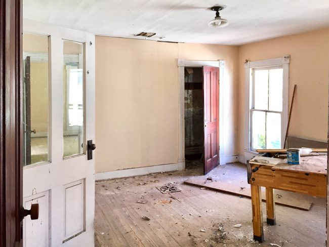
Here’s the central hall we added, so you can see how it totally changed the entire upstairs for the better! We kept everything light in color, so it didn’t feel closed in, and we love how functional it all became with the addition of a few added walls and doorways. And if you’re looking for affordable hallway or bathroom or closet lights, these small industrial guys are such a great price and look really clean. The putty color on top is perfect. 
This is the small but cozy middle bedroom that we furnished simply with some soft upholstered items, wood tones, and then some nice brass and oil-rubbed bronze touches. 
BUNK ROOMIf you spin around in the doorway of the middle bedroom above, you’ll face the doorway to the bunk room, which was one of the worst areas in the house when we bought it. The walls were so damaged & rotten, that’s light from outside that’s shining in (and yes, if light can come in, every time it rained this room rotted more – we couldn’t even stand in a few parts of it because the floor was so badly damaged it could have collapsed). 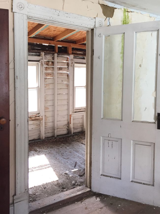
There were also some animals living in here – hence all that debris on the floor. It was a mess. 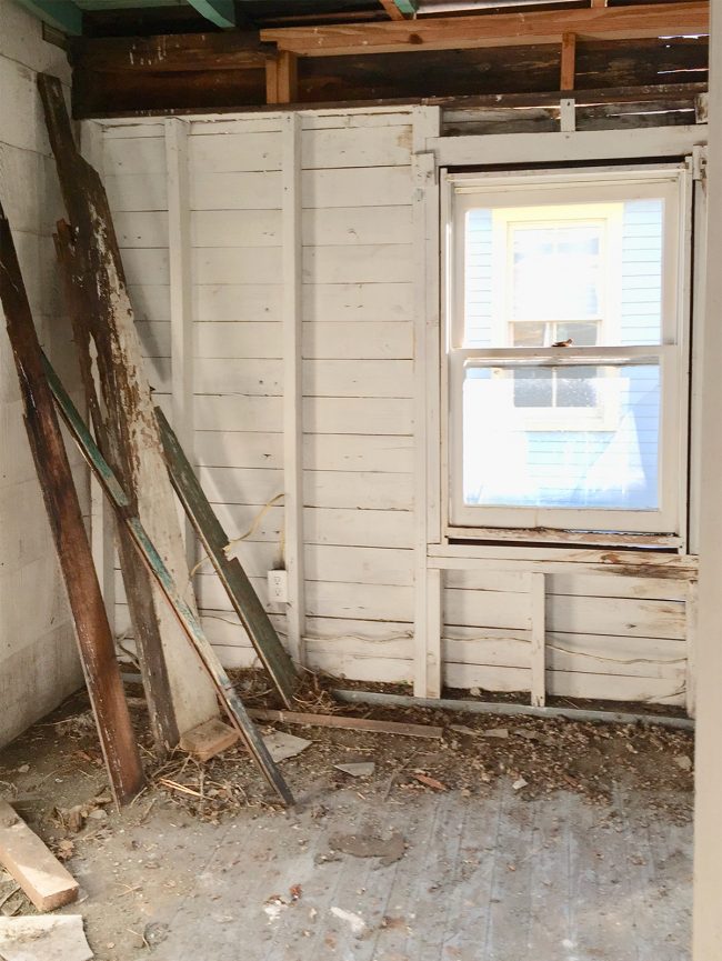
Here’s that room now, after completely removing that side of the house and rebuilding it from scratch. We love to save what we can, but it just wasn’t secure or salvageable – but it was worth all that work because now it’s clean, and cozy, and free of animal excrement! HOORAY! 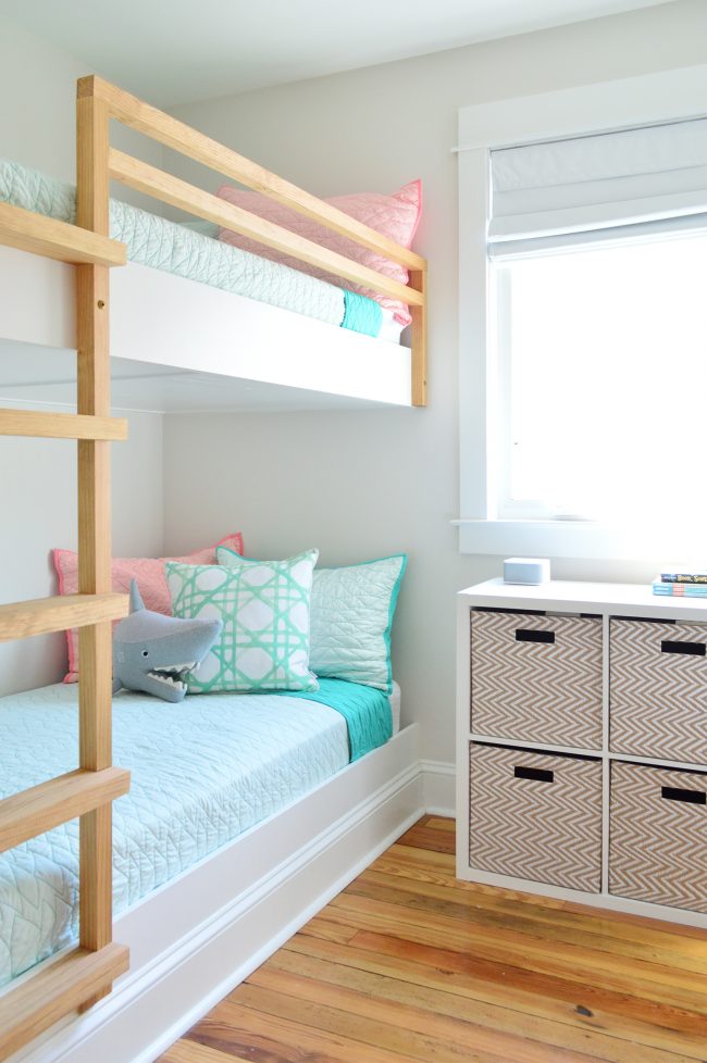
We built the bunk beds above that you see from scratch (here’s the tutorial for you) and had fun trying to get the wood ladder to tie into the original heart pine floors. That’s right, we saved them and put them back in when this portion of the house was rebuilt! HALL BATHROOMHere’s another shot of the bunk room, this one is if you have your back to the bunks. You can see that totally open area in the ceiling at the corner where every animal was slipping in with all of their friends. 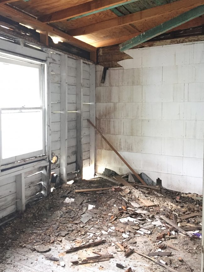
We actually realized that we didn’t need such a long skinny room for the bunks when we were rebuilding, so somehow we squeezed a full bathroom, complete with a shower, into this space as well as the bunk room! It was another super functional update that we’re so glad we made. 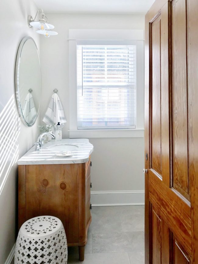
You access this bathroom from the same hallway you get to the bunk room and the middle bedroom, and we loved adding a lot of personality with that blue patterned tile on the wall. Oh and I should mention that every single wood door upstairs is original to the house. We stripped and waxed them so they’re completely refreshed looking, but they still have great old details like the original latches and knobs (this one has a tiny ceramic knob, but many others have larger turned wood ones – they’re all so full of wonderful character and still work well for us). 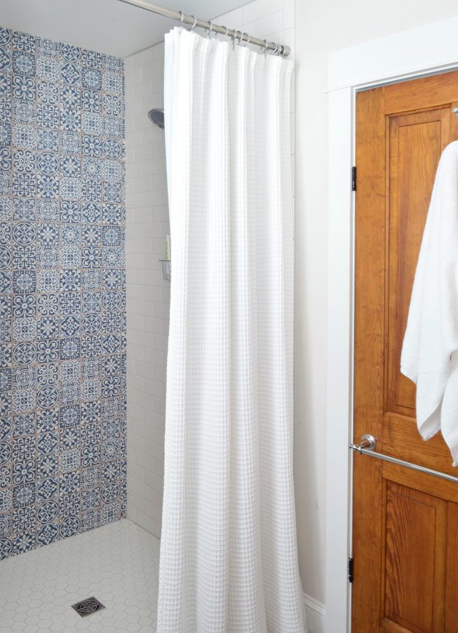
BACK BEDROOMThis was the view when we bought the house if you walked up the back stairs and looking into the back bedroom, which used to open right up to the stairs themselves. 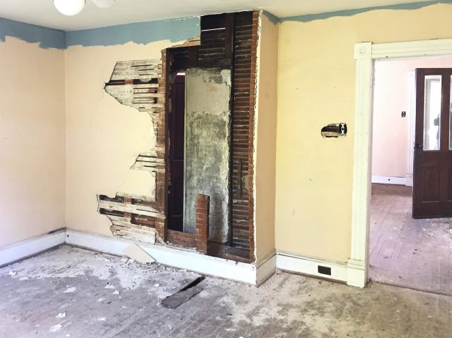
We didn’t do much reconfiguring of that wall you see above, but boy did it transform when we redid the walls and refinished the floors! There’s another original door and you can see what I mean about the wooden doorknobs that a lot of them have! They’re so unique and feel so solid in your hands. 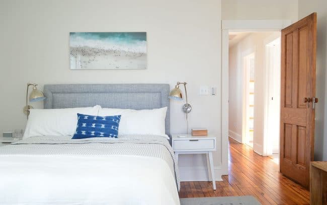
If you spin around and stand with your back to the doorway above, this was the view when we bought the house. See how the stairs just popped you up into the room without much privacy for anyone sleeping in the back bedroom (which we turned into the master bedroom). 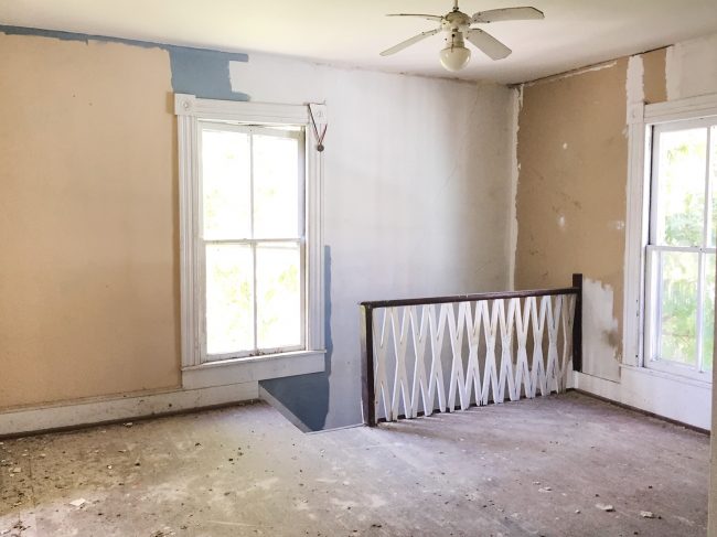
Well, after A TON of brainstorming, we came up with the idea of pocket doors that could be open so the light from that window would still pass into the bedroom, but at night (when there’s no light to enjoy anyway) they can be closed for privacy – so we can sleep in the bedroom and not feel like anyone in the kitchen can just pop up into our space. They create such nice privacy and also feel extremely original. Whenever anyone tours the house they can’t believe they weren’t there before. 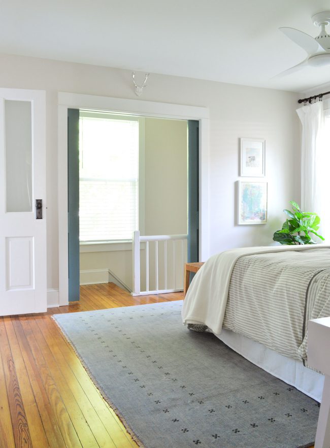
Also, a quick chat about fans. They’re so nice in vacation house bedrooms – many people prefer to sleep with one on for a gentle breeze and we didn’t get it until we added them to all of the bedrooms here at the beach house & NOW WE GET IT! They’re also hard to find attractive ones that are quiet and work well and don’t look awful – but we got these and think they’re just beautiful. In two years of using them, we have had zero issues and really love them. So much that we added fans to the duplex bedrooms too! MASTER BATHROOMThe master bathroom was arguably one of the worst rooms that we inherited. The floors were so brittle we couldn’t walk on them and the tub was extremely close to falling through to the first floor. Oh and the ceiling was collapsing above it. Generally: everything was falling apart. 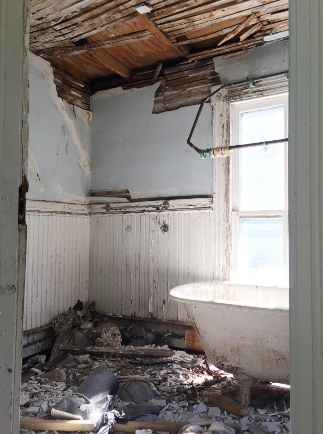
This room also had to be completely removed from the house and rebuilt from scratch since none of the studs or structure was stable – but again it was completely worth it because we earned a lovely master bathroom that doesn’t have holes in the ceiling or a floor that’s about to give way. SCORE! 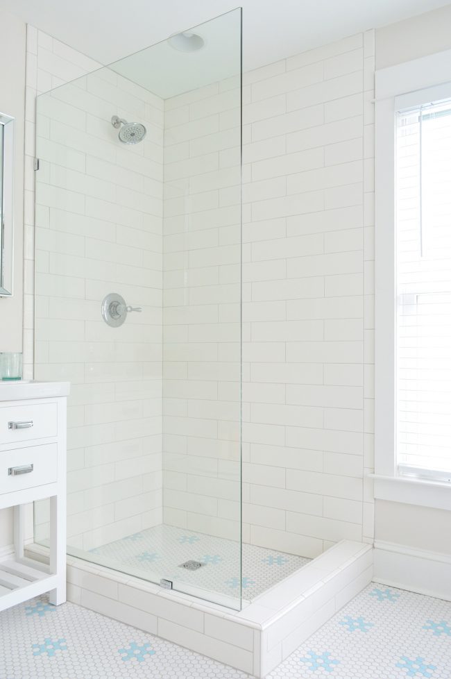
This was the view as you faced the tub (while standing in the bathroom doorway)… 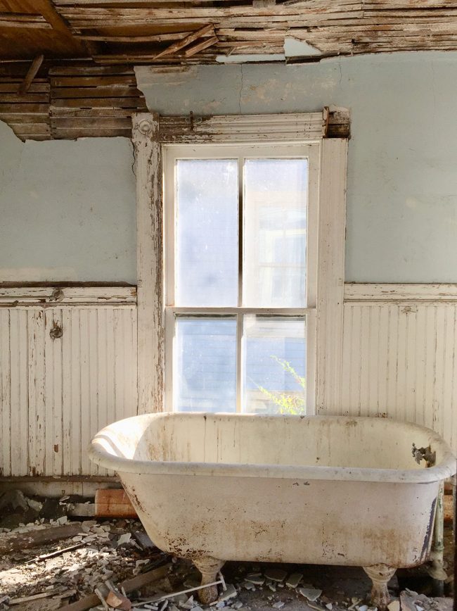
… and this is that same view now that everything is rebuilt. You can see that we reconfigured the tub to be off to the right, centered under another lovely and large window. That move meant that we could add a freestanding shower to the left of the room. We also laid this small hex floor by hand, making the little blue flowers one by one, tile by tile (more on that here). It took forever but it feels so charming and original and beachy. We are so glad we did it! It’s one of our favorite details in the entire house. 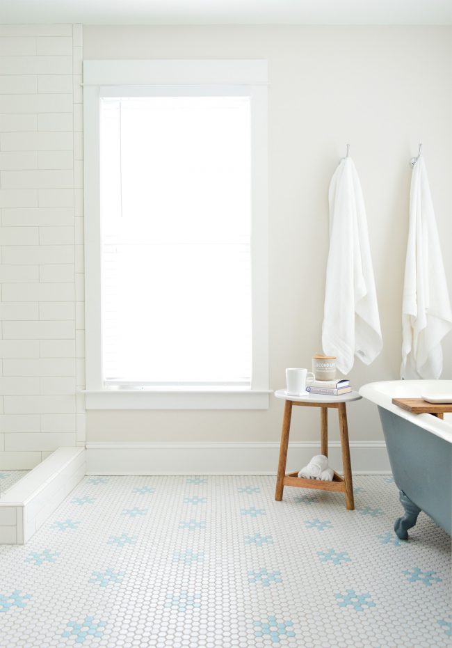
THE BACKYARDWe inherited a pretty overgrown and lackluster yard thanks to it being really small and full of poison ivy and not much else… 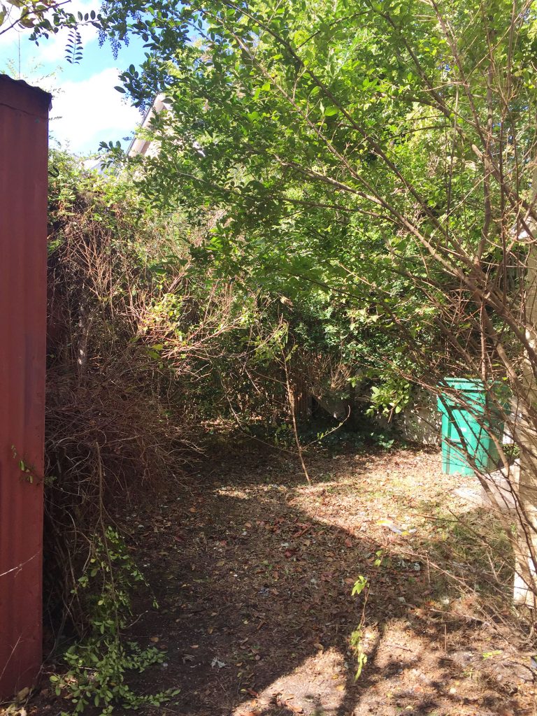
… but the after might be one of our favorite updates to date! 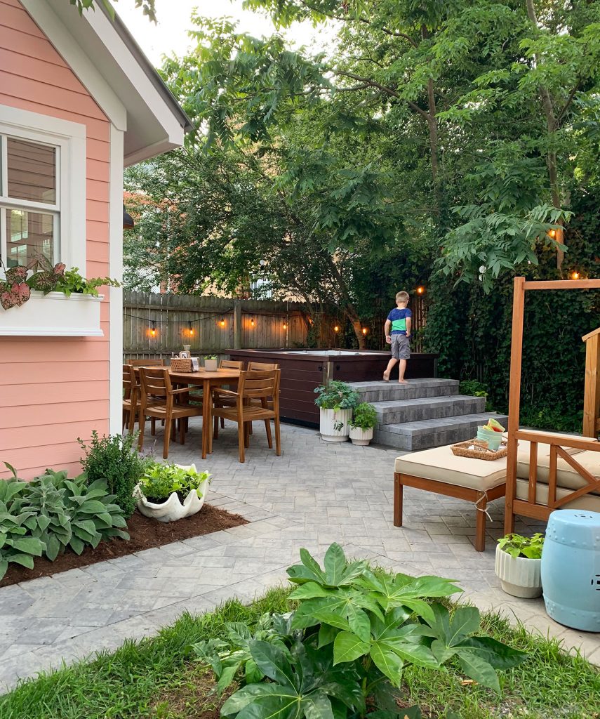
That before shot was from October 2016 and the next one was taken just a few weeks later, right after we cleared some of the brush and weeds. It’s also the project that gave John the worst case of poison ivy of his life. #memories So yes, this backyard and I got off to a rocky start. But all is forgiven now because it has become one of our absolute favorite places in the world. No joke. We are out here basically every night that we are in Cape Charles. 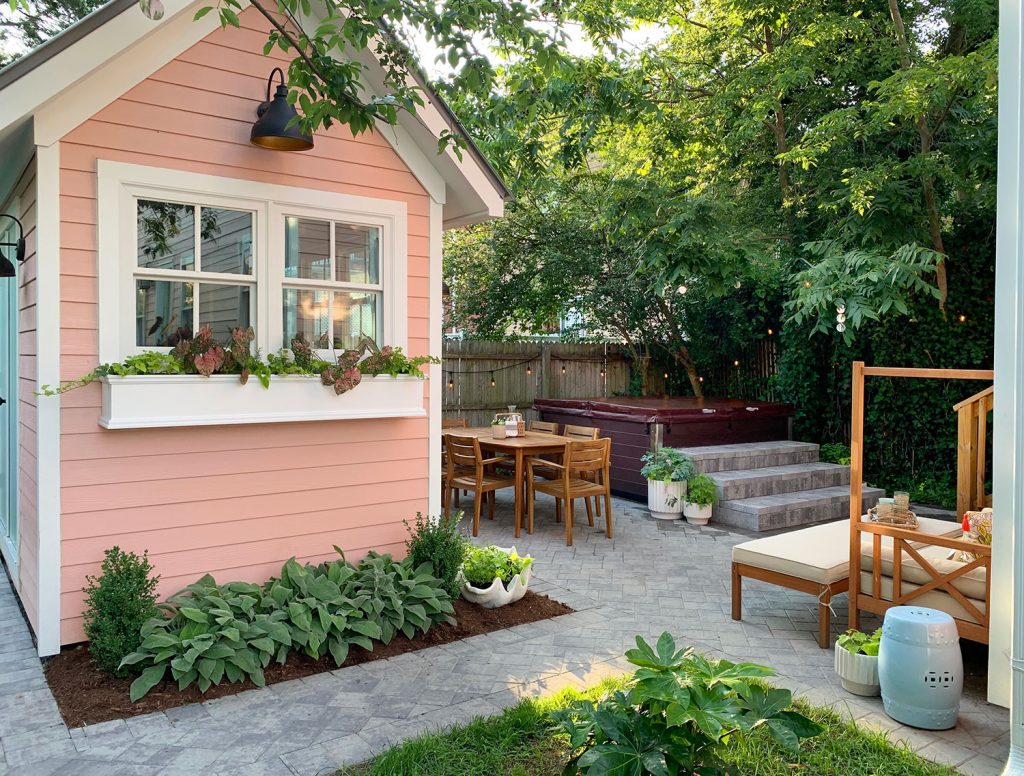
The end result is also made sweeter by the fact that we had to wait for it longer than originally planned. Our original schedule was to tackle this in the fall of 2017, once our contractor Sean finished the inside of the house. But a new little project distracted all of us (ahem, the duplex!) and we back-burnered the beach house backyard. So for our first few months of staying in the otherwise finished beach house, this was our view out the back door: 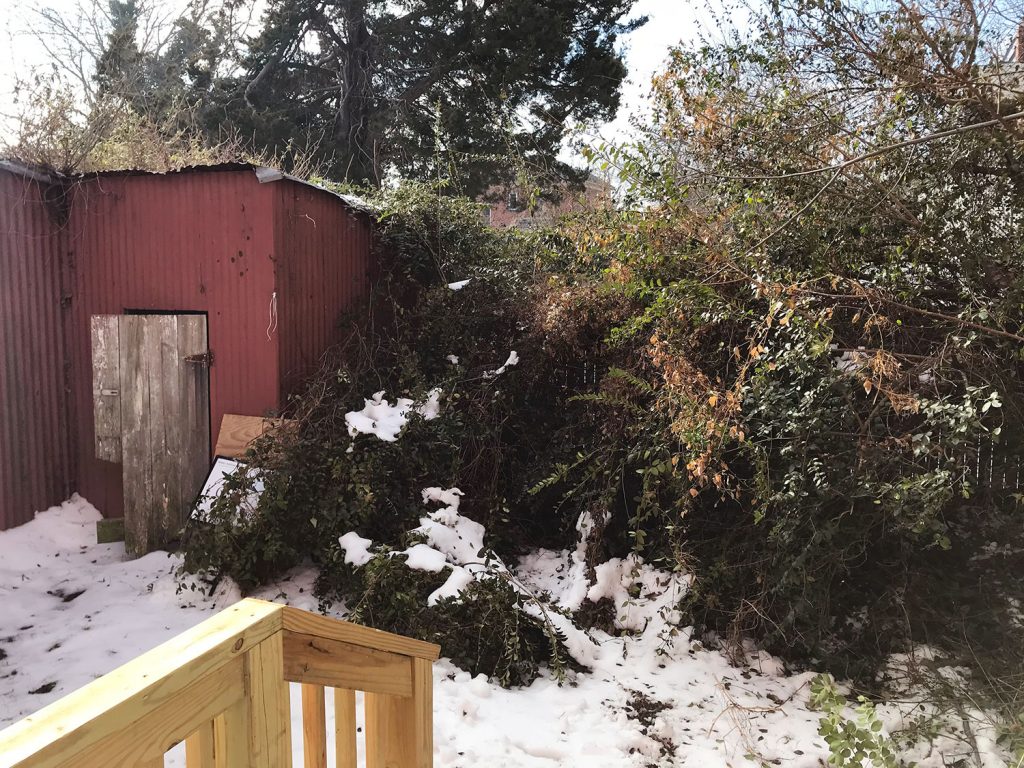
Slowly but surely we got moving back there – getting a hot tub, adding a paver patio, and getting a shed built in a spot that would make the most of the layout and give us a nice nestled feeling. And thanks to a few strategic furnishings and a lot of greenery, here we are today! Our little backyard beach house oasis… 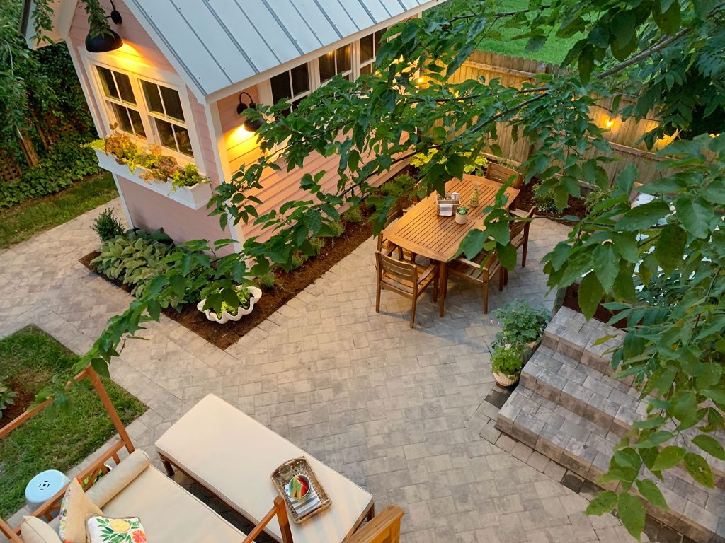
The before shot below was the red rusted out shed we got with the house: 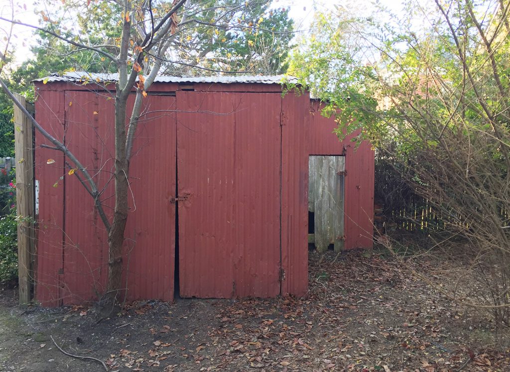
And here’s our new setup, which allows us to enter the shed from the left side (that path leads to two double doors that swing out without disrupting the dining area to the right – plus we got to add a charming planter box on the front). 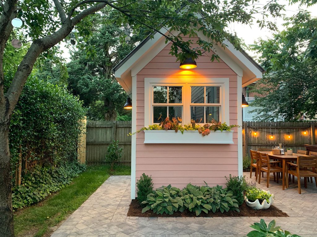
Right across from the hot tub is our outdoor shower. Our contractor installed the same vinyl outdoor shower kit that he put in over at the duplex and it’s quickly becoming the most used shower in the entire house. 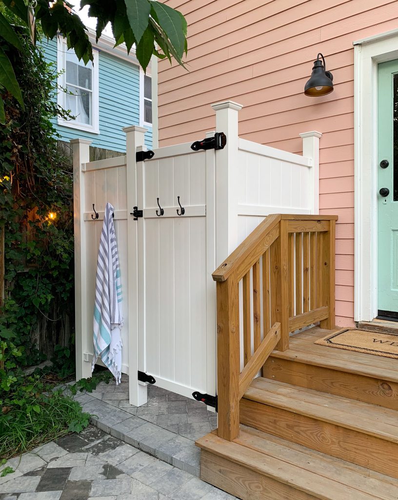
Oh, and this is what that same area looked like when we bought the house – complete with a not-so-safe-looking awning that we tore off ourselves. But the back door is still the same one, we just repainted it a cheerful new color (SW Pale Patina – the same color as the duplex shutters and the doors to our pink shed). 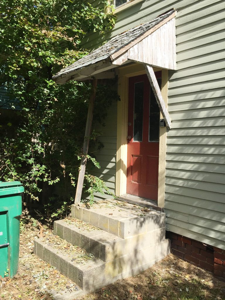
And I’ll leave you with one last before & after. This was the view down our side yard when we bought the house (ours was the tree-covered one on the right side). 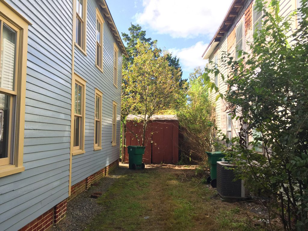
And here’s that view today. The fence is also new and matches the ones that both of our neighbors already have in their side yards. It gives us some privacy, allows our dog Burger to be loose in the backyard, and offers a sweet little peek down towards the shed when it’s open. It also swings to be double-wide when needed (future planning for parking a golf cart back there). We love that our neighbors on both sides have the same one so from the street it all looks nicely cohesive – once ours weathers to be that darker brown/gray color it’ll be great. 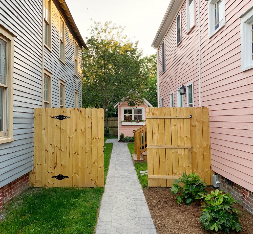
So we hope you guys enjoyed that beach house before & after fest. And remember you can find all the paint colors & furniture/accessory links on our Beach House page – there are just some linked here – but that post is much more exhaustive. You can also see the downstairs before & afters of the beach house here on our finally finished (it’s only a year overdue ;) Beach House Before & After page, which you can find from now on under the blog header in the dropdown menu that says Before & After. And you can browse all of our beach house posts & projects here. *This post contains affiliate links* The post Before & Afters Of Our Beach House: Upstairs appeared first on Young House Love. Via https://www.younghouselove.com/beach-house-before-and-after-upstairs/ When we shared the duplex backyard makeovers last month, I promised more details about how we made the decorative oars that hang on each shed. So today I’ve got a detailed tutorial for you (including how NOT to screw up your attempts to make them outdoor friendly) along with a few other “hacks” you guys asked about. 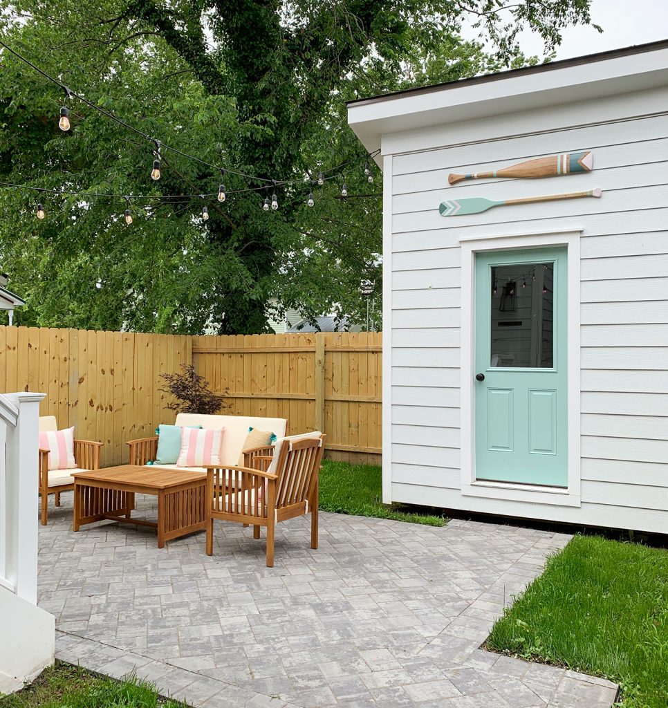
The oars actually were not part of our original plans. But after the sheds were built we nixed our plans to run electricity to them (for cost reasons – and because they really don’t need it). But the empty space where we’d planned to hang a light above the door needed… something. 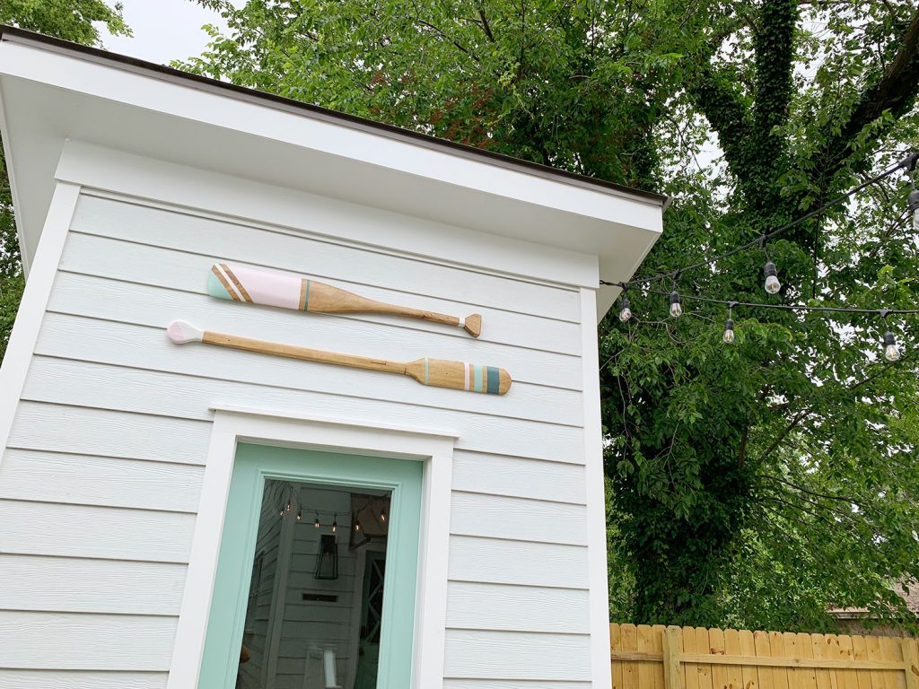
That something became oars after a trip to HomeGoods where we stumbled upon a decorative surfboard. Cape Charles isn’t really a surfing town, but there is plenty of kayaking and paddle boarding, so oars felt a bit more applicable for our little beach town. I went on the hunt for some on Etsy and found some really good options (like this, this, and the ones pictured below) but they all were a bit pricier than we had in mind. Just couldn’t justify spending $350+ on this project to end up with four cool looking oars to hang on the sheds. 
We actually ditched the idea entirely for a couple of weeks, but then we stumbled upon two decorative oars at HomeGoods for $25 each. They weren’t the colors or design we wanted, but that can always be fixed with paint! So we bought them and took them to Cape Charles and held them up to make sure we were barking up the right tree. We wanted to make sure we liked the size & shape before altering them with paint (thereby making it impossible to return them). 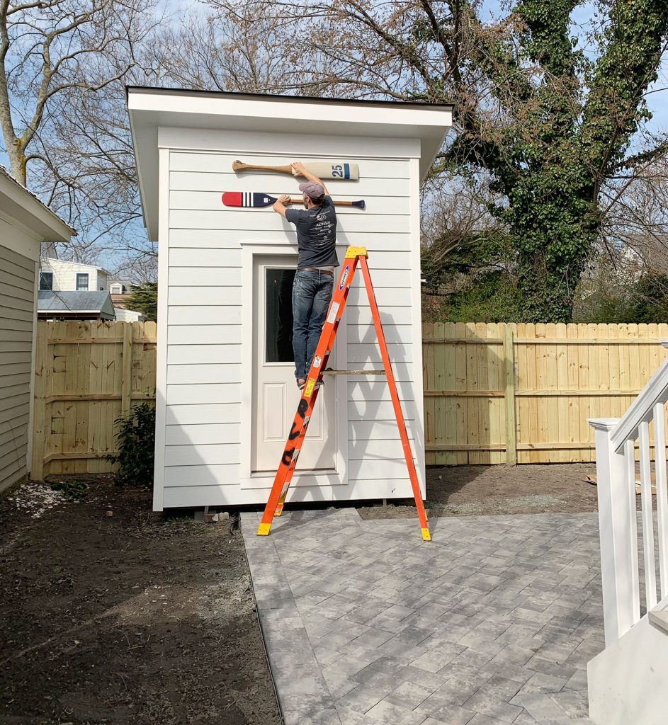
With renewed excitement for this idea, we tracked down two MORE decorative oars (thanks to having two HomeGoods in Richmond). All four of them cost a little over $100, which was great… but they didn’t look the way we wanted. They actually looked pretty awful together at this point: 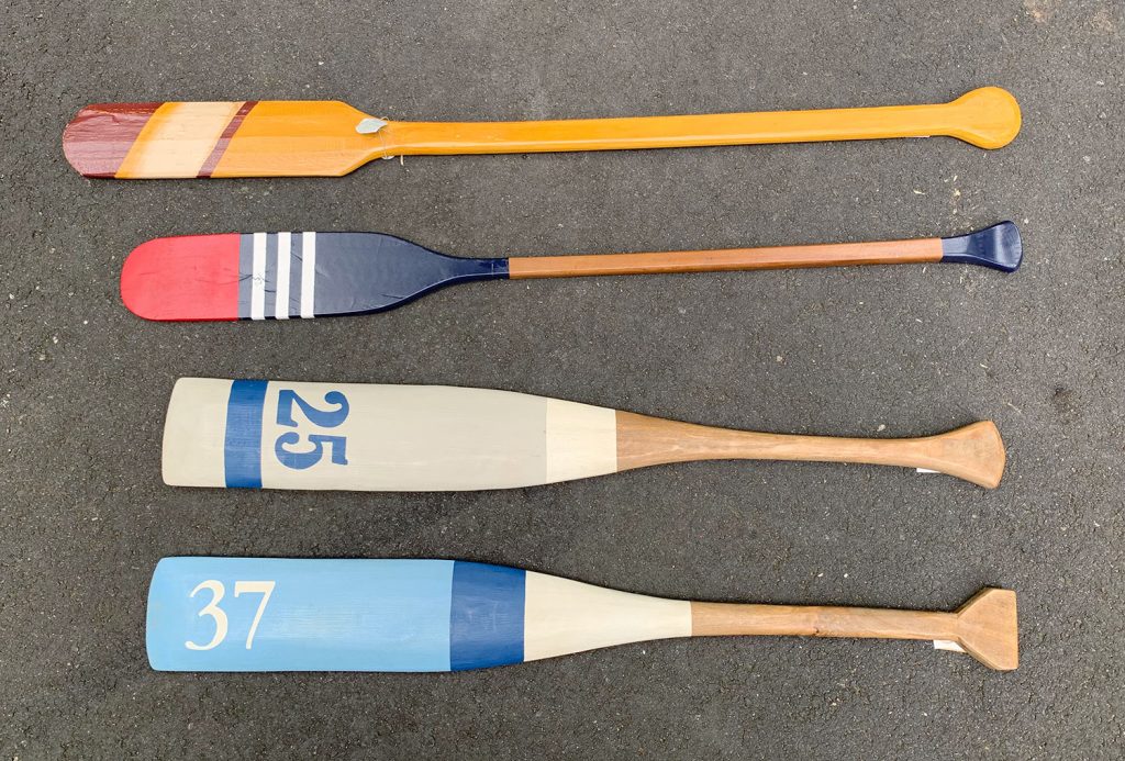
But I was emboldened by our luck at sanding down and refinishing the duplex dining tables, so I took to sanding each down to their raw wood. Here’s the orbital sander I used, which does the job really well. 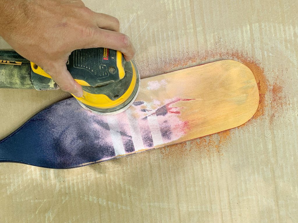
It took some elbow grease, but the results were extremely encouraging. Here’s a side-by-side of the two most similar oars – one sanded, one not. 
Once I had them all sanded down, I stained them all to get their varying wood tones looking more similar. It was basically trial and error of various leftover stain cans in our garage, but I am 95% sure it involved RustOleum Summer Oak and Minwax Weathered Oak being layered over each other. Before I stained them I also took a picture of them grouped on the ground and started Photoshopping various stripes and shapes on them. YES, THIS IS THE MOST ANYONE HAS EVER DONE IN THE PURSUIT OF PERFECTLY COORDINATING DECORATIVE OARS. I feel like I deserve a Bachlors of Science in Oarology at this point. 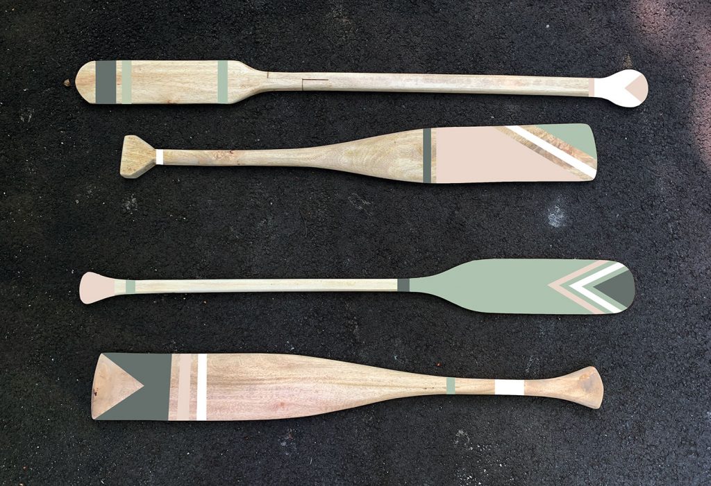
Anyway, we knew we wanted to use colors inspired by those found elsewhere in the duplex, like the mint green shutters, the white siding, and the muted pink and green found on the interior doors. So doing all of this in Photoshop helped us fine tune our direction before cracking open any paint cans. Also it earned me that highly esteemed Oarology degree. (*steps up to podium and clears throat*) “I’d like to thank my mom and dad, who instilled a love of oars at an early age…” Right, back to the tutorial. Next we used the digital mock-up to tape off each oar using painters tape. We intentionally left a lot of wood “stripes” in our design (you know, the areas UNDER the tape) because whenever two colors touch, you have to paint one and let it dry before you can paint the other. So for efficiency we minimized these instances, but we didn’t completely eliminate them. The reason you don’t see any tape on the top section of that third oar is because I had to do a base of the mint color before I could tape and paint my next colors. 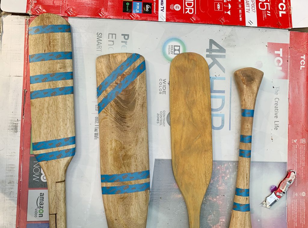
Once everything was taped, I primed each area first (this is our favorite primer) and then once that had dried, I painted each section – being careful to reference my rendering along the way (although we did deviate a little as we went). Except for the mint color (SW Pale Patina) we didn’t use the exact paint colors we used elsewhere in the duplex. The white was just an exterior white we had on hand (SW Snowbound) and the pink and navy were more saturated versions of the interior doors colors (SW Downing Pink and SW Riverway, respectively). You definitely should use exterior paint if you’re going to hang your oars outside, FYI. Also colors tend to wash out in exterior lighting (there’s more sun outside than inside) so you sometimes need to go darker or more intense with a color than you would inside your house. 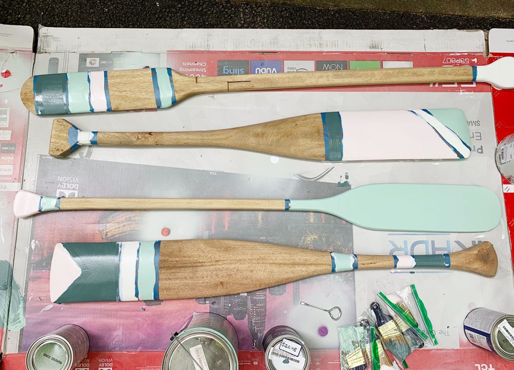
The project was going great at this point. Things were drying quickly in the heat outside. We got that unmatched satisfaction of peeling off a crisp line of painters tape… 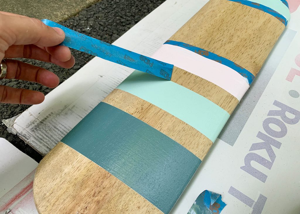
AND THEN THINGS TOOK A TURN. And this is where I want you to learn from my mistake. After I had finished painting all of the stripes, my last step was to seal the whole thing so it’d be even more durable outdoors (these things will be exposed to the elements 24/7/365 (and that’s not just rain, it’s lots of heat and even snow). So we wanted to layer on an exterior grade polyurethane sealer, which are typically oil based – but VERY durable. Now, I should’ve tested the sealer I had on hand in an inconspicuous place first – but I was running up against a weekend that we were going to Cape Charles and I wanted to finish these and bring them with me. So I just WENT FOR IT. Sherry described what happened next as “not a big deal” and “nothing to freak out over – John, you’re being crazy.” But I had gotten so pumped about how these were turning out so far that I was extremely frustrated at myself for messing them up on the last step. Here’s what happened: Oil-based stains have a tendency to yellow. That’s why we use water-based ones in most of our projects. But again, exterior-grade = oil-based. And we didn’t want these oars to get ruined over time because we used the wrong sealant. But, I was bothered by HOW YELLOW it made the colors and because the oars are slightly rounded, the stain pooled as it dried in various spots – leaving brownish-yellow streaks and dots along the oars. 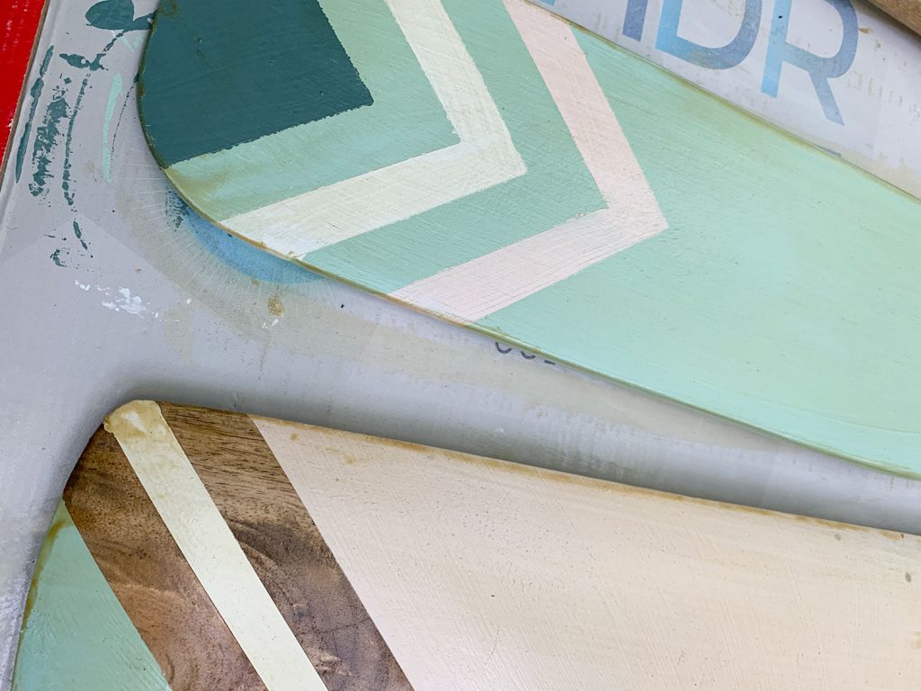
Sherry’s right that it’s a relatively minor issue – one that probably wouldn’t be super detectible from the distance at which they’d be seen anyways. But I was annoyed at how much more “rustic” the oars had become due to the yellowing and the streaking. So I did the only sensible/crazy thing that a Certified Oarologist 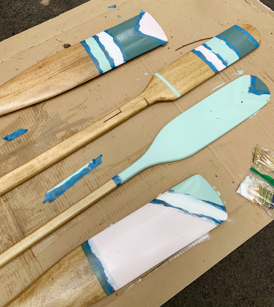
Because here’s the thing we didn’t really think about when we started this project: we were using exterior paints on everything, so they didn’t actually need to be sealed. Only the wood needed sealing. Soooooo… if I were doing this again (or if you’re at home doing it right now – first of all welcome to the field, it’s good to have a fellow Oarologist in my midst) I would’ve sealed the wood (both sides, btw) BEFORE I painted any of the stripes or detailing onto the oars. Would’ve dodged the entire bullet and the entire oar would be durable and outdoor-safe. In the end everything was fine (although the extra paint job meant we cut it a bit closer to rental season than we’d hoped when it came to actually hanging these up) and we really love how they turned out. Hanging them was simple too – we just drove a 3″ exterior screw through the oar and siding, right into a stud behind it (I predrilled a small hole in the oar to make it sink right through easily). 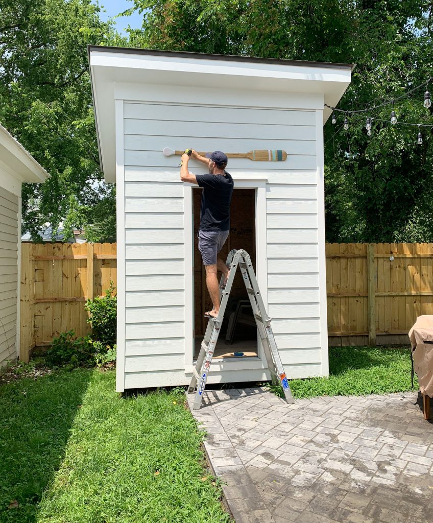
You can see the screw heads in the photo below (see the little dots). I tried to avoid putting them through painted sections when I could, since they seem to blend more into the wood tone than the lighter painted sections, but ultimately your eyes don’t really focus on them unless you’re actively looking for them. 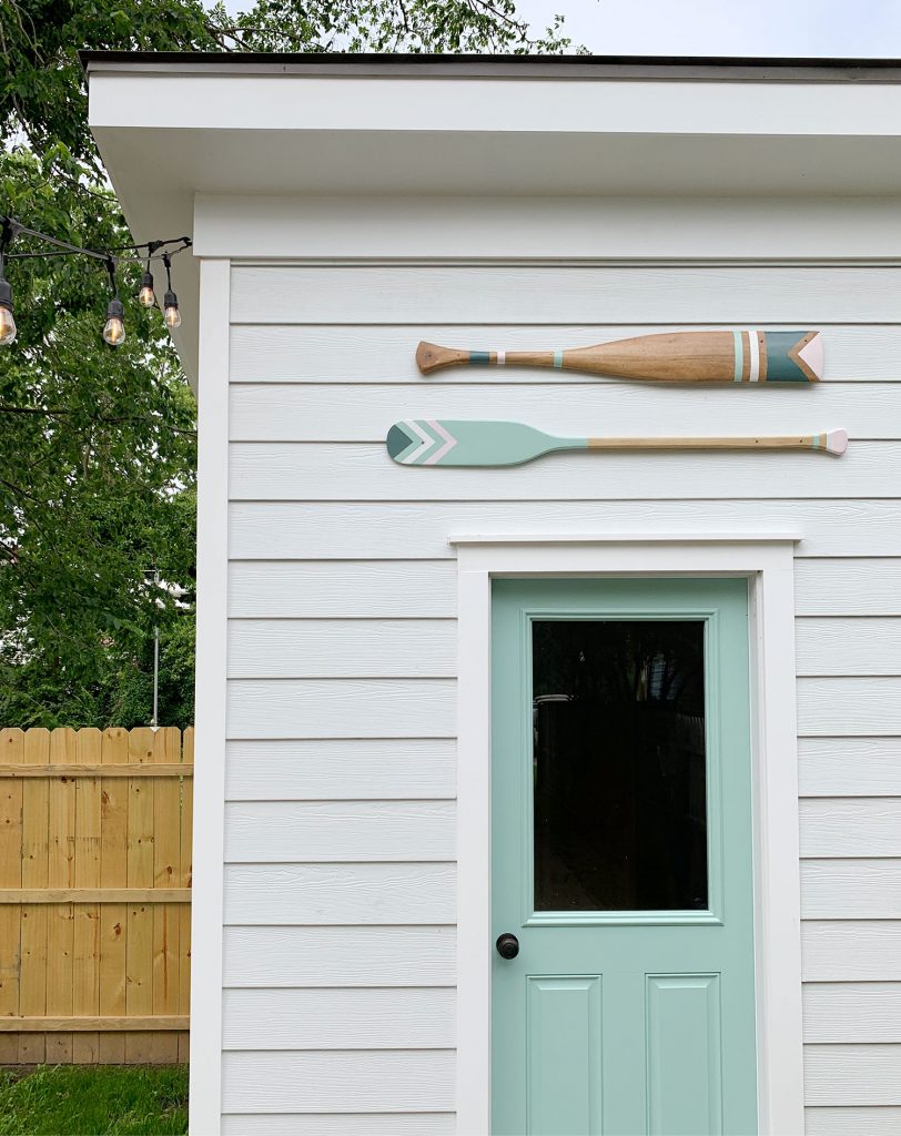
This tutorial actually should hold up for anything that’s wood that you’re thinking of sanding, staining, painting, and hanging outside. So if you’re thinking about a surf board instead – or a sign with your family name or something – this process would work. Also, remember to always add string lights (these are the ones we use everywhere) because they make literally everything better. 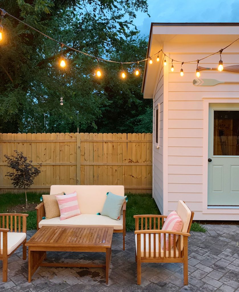
To see the full reveal of our duplex backyard (with sources and info on the sheds, patio, furniture etc) click here – and if you haven’t seen the pink house backyard makeover, which we finished right after the duplex yard, you have to check that out right here. *This post contains affiliate links The post How To Make Decorative Oars (And How To Not Almost Ruin Them Like I Did) appeared first on Young House Love. Via https://www.younghouselove.com/how-to-make-decorative-oars/ Finally… we have a full video tour of both sides of the duplex! A ton of people have asked for this (or asked if they missed it) and, well, today is the day. If nothing else, I recommend watching it to see the ecstatic relief on my face at the end that WE. ARE. DONE! Also I talk through a bunch of our changes and choices throughout the reno, and share some of our favorite decisions that upgraded the house in the biggest ways. 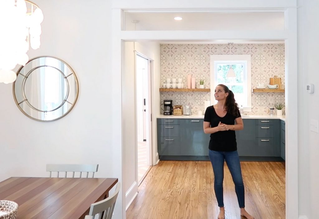
The video is also just good for seeing how each room flows together, checking out what’s different from side to side, and basically “walking through” the entire project with us. Just click play to watch it below: Note: If you’re reading this in a feed reader, you may need to click through to see the video. You can also watch it here on YouTube. And speaking of finally, we’ve also made a Duplex Source List page for everyone who has been asking us over the past six months (sorry for the wait, but it’s very thorough!). We have yet to add it to our website header bar, but here’s a shortcut to it. And it’s linked in our Instagram profile menu too. This is a screen shot of the beginning of that page (it’s linked too, so you can click it to see the entire source list): 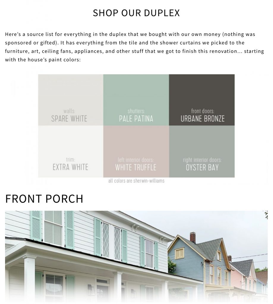
But back to the duplex makeover itself. If you want more details or different angles of each room that you saw (as well as some pretty crazy before & after photos), the following posts should fill you in on all the details:
The post A Video Tour Of The Duplex appeared first on Young House Love. Via https://www.younghouselove.com/duplex-video-tour/ |
 could do in this situation. I sanded off all the streaky spots, taped everything off again, and repainted all four oars. It wouldn’t de-yellow the wood tone, but at least I could get back the crisp vibrancy of the original paint colors we had chosen.